Overview
Overview
Overview
Overview
Overview
Bank of America, founded in 1904, is a historic banking institution serving around 67 million customers. As a pioneer in online banking since 1998, the website has evolved to offer diverse features. However, the current design has become outdated and lacks user-friendliness.
Bank of America, founded in 1904, is a historic banking institution serving around 67 million customers. As a pioneer in online banking since 1998, the website has evolved to offer diverse features. However, the current design has become outdated and lacks user-friendliness.
Bank of America, founded in 1904, is a historic banking institution serving around 67 million customers. As a pioneer in online banking since 1998, the website has evolved to offer diverse features. However, the current design has become outdated and lacks user-friendliness.
Bank of America, founded in 1904, is a historic banking institution serving around 67 million customers. As a pioneer in online banking since 1998, the website has evolved to offer diverse features. However, the current design has become outdated and lacks user-friendliness.
Problem statement
Problem statement
Problem statement
Problem statement
Problem statement
The Bank of America's digital presence, marked by its longstanding legacy and broad user base, has encountered challenges arising from an outdated website design. Despite being an early adopter of online banking services, the existing user interface no longer meets the evolving needs and expectations of modern customers. The Bank of America website, while providing an array of financial features, suffers from issues that impact usability, accessibility, and overall user experience.
The Bank of America's digital presence, marked by its longstanding legacy and broad user base, has encountered challenges arising from an outdated website design. Despite being an early adopter of online banking services, the existing user interface no longer meets the evolving needs and expectations of modern customers. The Bank of America website, while providing an array of financial features, suffers from issues that impact usability, accessibility, and overall user experience.
The Bank of America's digital presence, marked by its longstanding legacy and broad user base, has encountered challenges arising from an outdated website design. Despite being an early adopter of online banking services, the existing user interface no longer meets the evolving needs and expectations of modern customers. The Bank of America website, while providing an array of financial features, suffers from issues that impact usability, accessibility, and overall user experience.
The Bank of America's digital presence, marked by its longstanding legacy and broad user base, has encountered challenges arising from an outdated website design. Despite being an early adopter of online banking services, the existing user interface no longer meets the evolving needs and expectations of modern customers. The Bank of America website, while providing an array of financial features, suffers from issues that impact usability, accessibility, and overall user experience.
The Bank of America's digital presence, marked by its longstanding legacy and broad user base, has encountered challenges arising from an outdated website design. Despite being an early adopter of online banking services, the existing user interface no longer meets the evolving needs and expectations of modern customers. The Bank of America website, while providing an array of financial features, suffers from issues that impact usability, accessibility, and overall user experience.
Goal & Context
Goal & Context
Goal & Context
Goal & Context
Goal & Context
This redesign project aims to enhance the user experience for Bank of America's website, addressing usability challenges and design inconsistencies. The website's significance for international students and a diverse user base underscores the need for improved accessibility, streamlined navigation, and a cohesive visual identity.
By revamping the design, we intend to simplify user tasks, foster engagement, and provide a seamless digital banking environment. This case study outlines the comprehensive journey of transforming Bank of America's website to align with modern user expectations.

Research Process
Research Process
Research Process
Research Process
Research Process
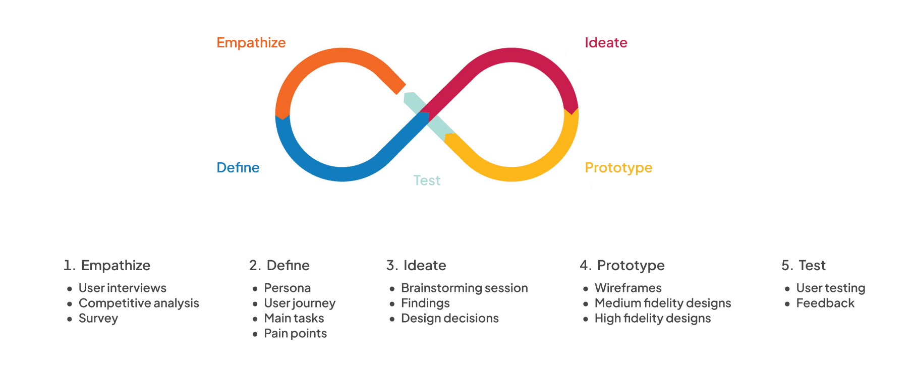
In the redesign planning, we initially performed a heuristic evaluation to uncover key issues. Considering Bank of America's wide-ranging user base, we then conducted surveys, user interviews, competitive analysis, and persona creation to gain comprehensive insights for the optimal redesign.
In the redesign planning, we initially performed a heuristic evaluation to uncover key issues. Considering Bank of America's wide-ranging user base, we then conducted surveys, user interviews, competitive analysis, and persona creation to gain comprehensive insights for the optimal redesign.
In the redesign planning, we initially performed a heuristic evaluation to uncover key issues. Considering Bank of America's wide-ranging user base, we then conducted surveys, user interviews, competitive analysis, and persona creation to gain comprehensive insights for the optimal redesign.
In the redesign planning, we initially performed a heuristic evaluation to uncover key issues. Considering Bank of America's wide-ranging user base, we then conducted surveys, user interviews, competitive analysis, and persona creation to gain comprehensive insights for the optimal redesign.
In the redesign planning, we initially performed a heuristic evaluation to uncover key issues. Considering Bank of America's wide-ranging user base, we then conducted surveys, user interviews, competitive analysis, and persona creation to gain comprehensive insights for the optimal redesign.
User Interviews
User Interviews
User Interviews
User Interviews
User Interviews
We conducted interviews to directly understand what Bank of America's customers think and experience when using the website. This helps us gather detailed insights that numbers alone can't provide. We expected the interviews to reveal what users like and dislike about the website, where they face issues, and what features they want. This information guides us in making the website better suited to their needs and preferences.
Here are some questions we asked:
1
Are you able to complete the tasks without any complications?
Assessing website usability is essential. This question focuses on the ease with which customers can accomplish tasks on the website. It helps identify potential barriers that might hinder smooth interactions.
1
Are you able to complete the tasks without any complications?
Assessing website usability is essential. This question focuses on the ease with which customers can accomplish tasks on the website. It helps identify potential barriers that might hinder smooth interactions.
1
Are you able to complete the tasks without any complications?
Assessing website usability is essential. This question focuses on the ease with which customers can accomplish tasks on the website. It helps identify potential barriers that might hinder smooth interactions.
1
Are you able to complete the tasks without any complications?
Assessing website usability is essential. This question focuses on the ease with which customers can accomplish tasks on the website. It helps identify potential barriers that might hinder smooth interactions.
1
Are you able to complete the tasks without any complications?
Assessing website usability is essential. This question focuses on the ease with which customers can accomplish tasks on the website. It helps identify potential barriers that might hinder smooth interactions.
1
Are you able to complete the tasks without any complications?
Assessing website usability is essential. This question focuses on the ease with which customers can accomplish tasks on the website. It helps identify potential barriers that might hinder smooth interactions.
2
What aspects of Bank of America's website, in your opinion, could be improved to better serve your needs as a customer?
This question directly targets areas of improvement from a user perspective. Feedback on specific features or functionalities that customers find lacking can guide the redesign process toward enhancing user experience.
3
What kinds of tools or features do you think are the most useful on the website?
Identifying valuable features from the user's perspective is key. This input can validate existing strengths and guide the emphasis on certain features during the redesign.
3
What kinds of tools or features do you think are the most useful on the website?
Identifying valuable features from the user's perspective is key. This input can validate existing strengths and guide the emphasis on certain features during the redesign.
3
What kinds of tools or features do you think are the most useful on the website?
Identifying valuable features from the user's perspective is key. This input can validate existing strengths and guide the emphasis on certain features during the redesign.
3
What kinds of tools or features do you think are the most useful on the website?
Identifying valuable features from the user's perspective is key. This input can validate existing strengths and guide the emphasis on certain features during the redesign.
3
What kinds of tools or features do you think are the most useful on the website?
Identifying valuable features from the user's perspective is key. This input can validate existing strengths and guide the emphasis on certain features during the redesign.
3
What kinds of tools or features do you think are the most useful on the website?
Identifying valuable features from the user's perspective is key. This input can validate existing strengths and guide the emphasis on certain features during the redesign.
4
Can you think of a time when you encountered an issue while using Bank of America's website? How was the issue resolved?
Gathering specific instances of issues and their resolution offers insights into the effectiveness of customer support and problem-solving mechanisms.
4
Can you think of a time when you encountered an issue while using Bank of America's website? How was the issue resolved?
Gathering specific instances of issues and their resolution offers insights into the effectiveness of customer support and problem-solving mechanisms.
4
Can you think of a time when you encountered an issue while using Bank of America's website? How was the issue resolved?
Gathering specific instances of issues and their resolution offers insights into the effectiveness of customer support and problem-solving mechanisms.
4
Can you think of a time when you encountered an issue while using Bank of America's website? How was the issue resolved?
Gathering specific instances of issues and their resolution offers insights into the effectiveness of customer support and problem-solving mechanisms.
4
Can you think of a time when you encountered an issue while using Bank of America's website? How was the issue resolved?
Gathering specific instances of issues and their resolution offers insights into the effectiveness of customer support and problem-solving mechanisms.
4
Can you think of a time when you encountered an issue while using Bank of America's website? How was the issue resolved?
Gathering specific instances of issues and their resolution offers insights into the effectiveness of customer support and problem-solving mechanisms.
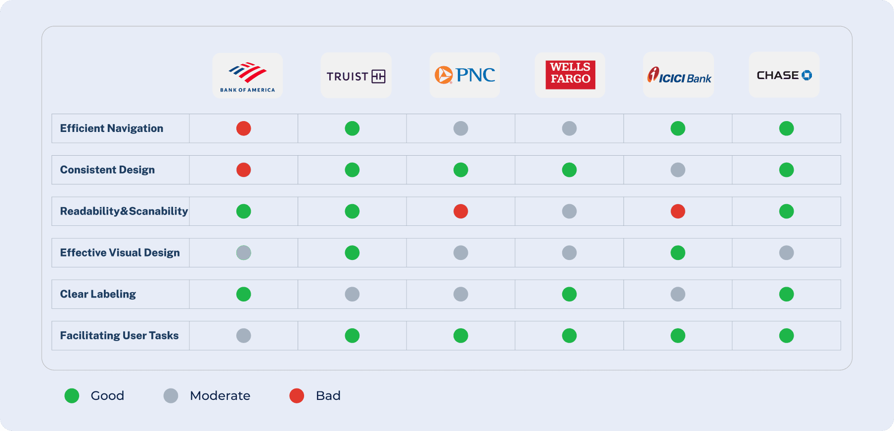
Competitive Analysis
Competitive Analysis
Competitive Analysis
Competitive Analysis
Competitive Analysis
1
PNC Bank
PNC Bank's website is cluttered and outdated, lacking intuitive navigation. Bank of America's design, though cluttered, is more user-friendly, featuring transaction display on the homepage. PNC's design is balanced but requires deeper navigation for essential tasks.
1
PNC Bank
PNC Bank's website is cluttered and outdated, lacking intuitive navigation. Bank of America's design, though cluttered, is more user-friendly, featuring transaction display on the homepage. PNC's design is balanced but requires deeper navigation for essential tasks.
1
PNC Bank
PNC Bank's website is cluttered and outdated, lacking intuitive navigation. Bank of America's design, though cluttered, is more user-friendly, featuring transaction display on the homepage. PNC's design is balanced but requires deeper navigation for essential tasks.
1
PNC Bank
PNC Bank's website is cluttered and outdated, lacking intuitive navigation. Bank of America's design, though cluttered, is more user-friendly, featuring transaction display on the homepage. PNC's design is balanced but requires deeper navigation for essential tasks.
1
PNC Bank
PNC Bank's website is cluttered and outdated, lacking intuitive navigation. Bank of America's design, though cluttered, is more user-friendly, featuring transaction display on the homepage. PNC's design is balanced but requires deeper navigation for essential tasks.
1
PNC Bank
PNC Bank's website is cluttered and outdated, lacking intuitive navigation. Bank of America's design, though cluttered, is more user-friendly, featuring transaction display on the homepage. PNC's design is balanced but requires deeper navigation for essential tasks.
2
Chase
Chase's website excels with a professional layout and effective use of space, including a sidebar for navigation. It offers a more organized and user-friendly experience than Bank of America, with thoughtful micro-interactions and strategically placed alerts.
2
Chase
Chase's website excels with a professional layout and effective use of space, including a sidebar for navigation. It offers a more organized and user-friendly experience than Bank of America, with thoughtful micro-interactions and strategically placed alerts.
2
Chase
Chase's website excels with a professional layout and effective use of space, including a sidebar for navigation. It offers a more organized and user-friendly experience than Bank of America, with thoughtful micro-interactions and strategically placed alerts.
2
Chase
Chase's website excels with a professional layout and effective use of space, including a sidebar for navigation. It offers a more organized and user-friendly experience than Bank of America, with thoughtful micro-interactions and strategically placed alerts.
2
Chase
Chase's website excels with a professional layout and effective use of space, including a sidebar for navigation. It offers a more organized and user-friendly experience than Bank of America, with thoughtful micro-interactions and strategically placed alerts.
2
Chase
Chase's website excels with a professional layout and effective use of space, including a sidebar for navigation. It offers a more organized and user-friendly experience than Bank of America, with thoughtful micro-interactions and strategically placed alerts.
3
Truist Bank
Truist Bank's modern design contrasts with Bank of America's inconsistency. Truist offers a clean layout, streamlined navigation, and detailed insights. Its design is a strength, while Bank of America lacks consistency and prominent home screen features.
3
Truist Bank
Truist Bank's modern design contrasts with Bank of America's inconsistency. Truist offers a clean layout, streamlined navigation, and detailed insights. Its design is a strength, while Bank of America lacks consistency and prominent home screen features.
3
Truist Bank
Truist Bank's modern design contrasts with Bank of America's inconsistency. Truist offers a clean layout, streamlined navigation, and detailed insights. Its design is a strength, while Bank of America lacks consistency and prominent home screen features.
3
Truist Bank
Truist Bank's modern design contrasts with Bank of America's inconsistency. Truist offers a clean layout, streamlined navigation, and detailed insights. Its design is a strength, while Bank of America lacks consistency and prominent home screen features.
3
Truist Bank
Truist Bank's modern design contrasts with Bank of America's inconsistency. Truist offers a clean layout, streamlined navigation, and detailed insights. Its design is a strength, while Bank of America lacks consistency and prominent home screen features.
3
Truist Bank
Truist Bank's modern design contrasts with Bank of America's inconsistency. Truist offers a clean layout, streamlined navigation, and detailed insights. Its design is a strength, while Bank of America lacks consistency and prominent home screen features.
4
ICICI Bank
ICICI Bank's design is attractive but cluttered, while Bank of America's is more concise. Both lack consistency and suffer from visibility issues. ICICI offers subtle animations, but its complex dashboard hinders task completion. Bank of America excels in navigation and search options.
4
ICICI Bank
ICICI Bank's design is attractive but cluttered, while Bank of America's is more concise. Both lack consistency and suffer from visibility issues. ICICI offers subtle animations, but its complex dashboard hinders task completion. Bank of America excels in navigation and search options.
4
ICICI Bank
ICICI Bank's design is attractive but cluttered, while Bank of America's is more concise. Both lack consistency and suffer from visibility issues. ICICI offers subtle animations, but its complex dashboard hinders task completion. Bank of America excels in navigation and search options.
4
ICICI Bank
ICICI Bank's design is attractive but cluttered, while Bank of America's is more concise. Both lack consistency and suffer from visibility issues. ICICI offers subtle animations, but its complex dashboard hinders task completion. Bank of America excels in navigation and search options.
4
ICICI Bank
ICICI Bank's design is attractive but cluttered, while Bank of America's is more concise. Both lack consistency and suffer from visibility issues. ICICI offers subtle animations, but its complex dashboard hinders task completion. Bank of America excels in navigation and search options.
4
ICICI Bank
ICICI Bank's design is attractive but cluttered, while Bank of America's is more concise. Both lack consistency and suffer from visibility issues. ICICI offers subtle animations, but its complex dashboard hinders task completion. Bank of America excels in navigation and search options.
5
Wells Fargo
Bank of America's homepage is more informative, while Wells Fargo's layout is less cluttered but overwhelming. Both lack chatbot support, with Wells Fargo consistent but lacking in prominent home screen features.
5
Wells Fargo
Bank of America's homepage is more informative, while Wells Fargo's layout is less cluttered but overwhelming. Both lack chatbot support, with Wells Fargo consistent but lacking in prominent home screen features.
5
Wells Fargo
Bank of America's homepage is more informative, while Wells Fargo's layout is less cluttered but overwhelming. Both lack chatbot support, with Wells Fargo consistent but lacking in prominent home screen features.
5
Wells Fargo
Bank of America's homepage is more informative, while Wells Fargo's layout is less cluttered but overwhelming. Both lack chatbot support, with Wells Fargo consistent but lacking in prominent home screen features.
5
Wells Fargo
Bank of America's homepage is more informative, while Wells Fargo's layout is less cluttered but overwhelming. Both lack chatbot support, with Wells Fargo consistent but lacking in prominent home screen features.
5
Wells Fargo
Bank of America's homepage is more informative, while Wells Fargo's layout is less cluttered but overwhelming. Both lack chatbot support, with Wells Fargo consistent but lacking in prominent home screen features.
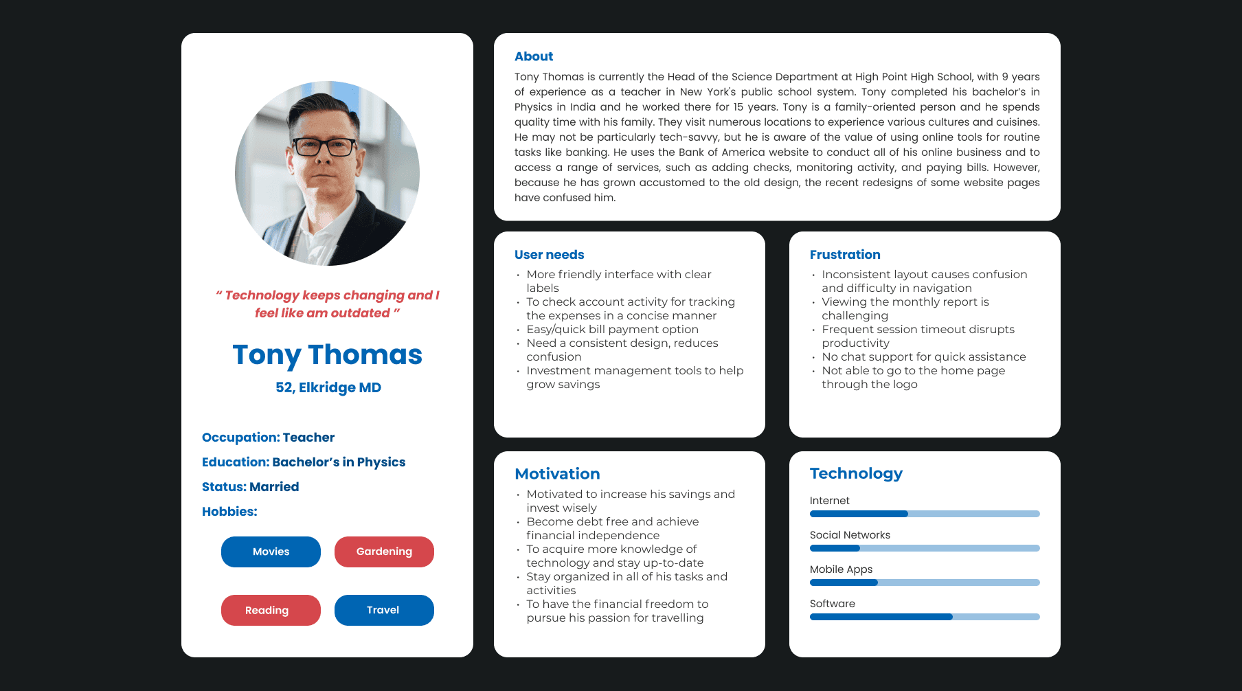
Personas
Personas
Personas
Personas
Two personas were selected for different reasons: one to represent users with limited technical familiarity(shown below) and the other to bring an advanced technological perspective. This diverse approach ensures that your redesign project considers a wide range of user experiences and technical needs, ultimately leading to a more inclusive and well-informed design.
Two personas were selected for different reasons: one to represent users with limited technical familiarity(shown below) and the other to bring an advanced technological perspective. This diverse approach ensures that your redesign project considers a wide range of user experiences and technical needs, ultimately leading to a more inclusive and well-informed design.
Two personas were selected for different reasons: one to represent users with limited technical familiarity(shown below) and the other to bring an advanced technological perspective. This diverse approach ensures that your redesign project considers a wide range of user experiences and technical needs, ultimately leading to a more inclusive and well-informed design.
Two personas were selected for different reasons: one to represent users with limited technical familiarity(shown below) and the other to bring an advanced technological perspective. This diverse approach ensures that your redesign project considers a wide range of user experiences and technical needs, ultimately leading to a more inclusive and well-informed design.
Pain points
Pain points
Pain points
Pain points
Pain points
1
Navigation Challenges
Users, especially those unfamiliar with the interface, struggled to navigate the website and complete tasks. This lack of familiarity hindered the overall user experience and usability.
1
Navigation Challenges
Users, especially those unfamiliar with the interface, struggled to navigate the website and complete tasks. This lack of familiarity hindered the overall user experience and usability.
1
Navigation Challenges
Users, especially those unfamiliar with the interface, struggled to navigate the website and complete tasks. This lack of familiarity hindered the overall user experience and usability.
1
Navigation Challenges
Users, especially those unfamiliar with the interface, struggled to navigate the website and complete tasks. This lack of familiarity hindered the overall user experience and usability.
1
Navigation Challenges
Users, especially those unfamiliar with the interface, struggled to navigate the website and complete tasks. This lack of familiarity hindered the overall user experience and usability.
1
Navigation Challenges
Users, especially those unfamiliar with the interface, struggled to navigate the website and complete tasks. This lack of familiarity hindered the overall user experience and usability.
2
Outdated Design
The website's design is outdated and fails to meet modern user expectations. The lack of a consistent and cohesive design language leads to user confusion and frustration.
2
Outdated Design
The website's design is outdated and fails to meet modern user expectations. The lack of a consistent and cohesive design language leads to user confusion and frustration.
2
Outdated Design
The website's design is outdated and fails to meet modern user expectations. The lack of a consistent and cohesive design language leads to user confusion and frustration.
2
Outdated Design
The website's design is outdated and fails to meet modern user expectations. The lack of a consistent and cohesive design language leads to user confusion and frustration.
2
Outdated Design
The website's design is outdated and fails to meet modern user expectations. The lack of a consistent and cohesive design language leads to user confusion and frustration.
2
Outdated Design
The website's design is outdated and fails to meet modern user expectations. The lack of a consistent and cohesive design language leads to user confusion and frustration.
3
Inconsistent Design Layout
Inconsistent design layouts across pages created confusion and an unattractive user experience. Consistency in design elements such as typefaces, colors, and layouts is essential for seamless navigation.
3
Inconsistent Design Layout
Inconsistent design layouts across pages created confusion and an unattractive user experience. Consistency in design elements such as typefaces, colors, and layouts is essential for seamless navigation.
3
Inconsistent Design Layout
Inconsistent design layouts across pages created confusion and an unattractive user experience. Consistency in design elements such as typefaces, colors, and layouts is essential for seamless navigation.
3
Inconsistent Design Layout
Inconsistent design layouts across pages created confusion and an unattractive user experience. Consistency in design elements such as typefaces, colors, and layouts is essential for seamless navigation.
3
Inconsistent Design Layout
Inconsistent design layouts across pages created confusion and an unattractive user experience. Consistency in design elements such as typefaces, colors, and layouts is essential for seamless navigation.
3
Inconsistent Design Layout
Inconsistent design layouts across pages created confusion and an unattractive user experience. Consistency in design elements such as typefaces, colors, and layouts is essential for seamless navigation.
4
Information Hierarchy Confusion
Inconsistent information hierarchy, such as varying placements of navigation menus and call-to-action buttons across pages, led to user confusion and difficulty in finding relevant information.
4
Information Hierarchy Confusion
Inconsistent information hierarchy, such as varying placements of navigation menus and call-to-action buttons across pages, led to user confusion and difficulty in finding relevant information.
4
Information Hierarchy Confusion
Inconsistent information hierarchy, such as varying placements of navigation menus and call-to-action buttons across pages, led to user confusion and difficulty in finding relevant information.
4
Information Hierarchy Confusion
Inconsistent information hierarchy, such as varying placements of navigation menus and call-to-action buttons across pages, led to user confusion and difficulty in finding relevant information.
4
Information Hierarchy Confusion
Inconsistent information hierarchy, such as varying placements of navigation menus and call-to-action buttons across pages, led to user confusion and difficulty in finding relevant information.
4
Information Hierarchy Confusion
Inconsistent information hierarchy, such as varying placements of navigation menus and call-to-action buttons across pages, led to user confusion and difficulty in finding relevant information.
5
Visual Balance and White Space
Some pages had an imbalanced layout with insufficient white space, resulting in a busy and unorganized appearance.
5
Visual Balance and White Space
Some pages had an imbalanced layout with insufficient white space, resulting in a busy and unorganized appearance.
5
Visual Balance and White Space
Some pages had an imbalanced layout with insufficient white space, resulting in a busy and unorganized appearance.
5
Visual Balance and White Space
Some pages had an imbalanced layout with insufficient white space, resulting in a busy and unorganized appearance.
5
Visual Balance and White Space
Some pages had an imbalanced layout with insufficient white space, resulting in a busy and unorganized appearance.
5
Visual Balance and White Space
Some pages had an imbalanced layout with insufficient white space, resulting in a busy and unorganized appearance.
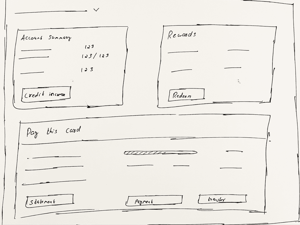
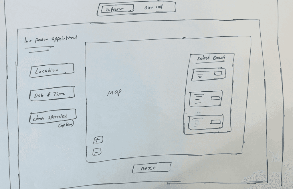
Low-Fidelity Wireframes
Low-Fidelity Wireframes
Low-Fidelity Wireframes
Low-Fidelity Wireframes
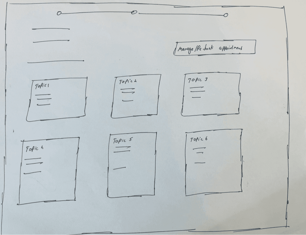
After identifying the key tasks, we initiated the design process by sketching out low-fidelity prototypes with pen and paper to lay the groundwork for the initial designs.
After identifying the key tasks, we initiated the design process by sketching out low-fidelity prototypes with pen and paper to lay the groundwork for the initial designs.
After identifying the key tasks, we initiated the design process by sketching out low-fidelity prototypes with pen and paper to lay the groundwork for the initial designs.
After identifying the key tasks, we initiated the design process by sketching out low-fidelity prototypes with pen and paper to lay the groundwork for the initial designs.


Medium-Fidelity Wireframes
Medium-Fidelity Wireframes
Medium-Fidelity Wireframes
Medium-Fidelity Wireframes
After carefully considering the feedback garnered from the Low-Fidelity Wireframes, we implemented valuable changes and enhancements
After carefully considering the feedback garnered from the Low-Fidelity Wireframes, we implemented valuable changes and enhancements
After carefully considering the feedback garnered from the Low-Fidelity Wireframes, we implemented valuable changes and enhancements
After carefully considering the feedback garnered from the Low-Fidelity Wireframes, we implemented valuable changes and enhancements

User Testing & Feedbacks
User Testing & Feedbacks
User Testing & Feedbacks
User Testing & Feedbacks
After completing the medium-fidelity design phase, we proceeded to conduct user testing with a select group of Bank of America users to gauge their reactions to the new designs. We facilitated a comprehensive walkthrough, allowing users to navigate through the interface and experience the changes firsthand. The feedback we received was overwhelmingly positive from 8 participants, indicating a strong affinity for the new features and options, despite lacking some high-fidelity details.
Among the highlights of the feedback were the users' appreciation for the added options and features. Additionally, valuable suggestions emerged, particularly regarding improvements to the designs. These included simplifying navigation for enhanced user experience and incorporating graphical representations to facilitate better comprehension of spending and other pertinent information.
This user testing phase not only affirmed the viability of our design direction but also provided invaluable insights for refining and enhancing the user experience further
High-Fidelity Design
High-Fidelity Design
High-Fidelity Design
High-Fidelity Design
Incorporating user research and feedback from initial designs, we developed a high-fidelity design addressing website issues and integrating desired features suggested by users for the BofA website.
Incorporating user research and feedback from initial designs, we developed a high-fidelity design addressing website issues and integrating desired features suggested by users for the BofA website.
Incorporating user research and feedback from initial designs, we developed a high-fidelity design addressing website issues and integrating desired features suggested by users for the BofA website.
Incorporating user research and feedback from initial designs, we developed a high-fidelity design addressing website issues and integrating desired features suggested by users for the BofA website.
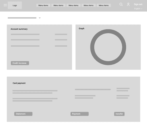
Home page
Home page
Home page
Home page

Solutions
Solutions
Solutions
Solutions
Significant attention was dedicated to the following designs, aimed at enhancing usability, improving cognitive recognition, and ensuring ease of use.
Significant attention was dedicated to the following designs, aimed at enhancing usability, improving cognitive recognition, and ensuring ease of use.
Significant attention was dedicated to the following designs, aimed at enhancing usability, improving cognitive recognition, and ensuring ease of use.
Significant attention was dedicated to the following designs, aimed at enhancing usability, improving cognitive recognition, and ensuring ease of use.
Navigation section
Navigation section
Navigation section
Navigation section

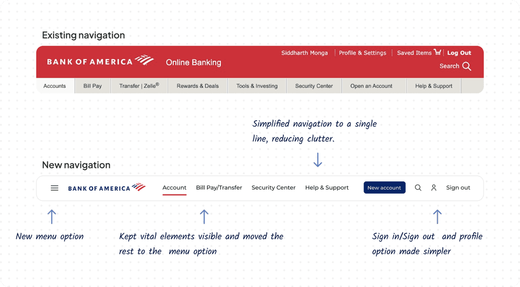
We noticed the navigation was overwhelming with numerous options, making it hard for users to find what they need. To fix this, we prioritized the main features and simplified the navigation, making it efficient and easy to use. Additional features are tucked away in a menu option, while the profile section is cleaned up with icons for easier identification.
We noticed the navigation was overwhelming with numerous options, making it hard for users to find what they need. To fix this, we prioritized the main features and simplified the navigation, making it efficient and easy to use. Additional features are tucked away in a menu option, while the profile section is cleaned up with icons for easier identification.
We noticed the navigation was overwhelming with numerous options, making it hard for users to find what they need. To fix this, we prioritized the main features and simplified the navigation, making it efficient and easy to use. Additional features are tucked away in a menu option, while the profile section is cleaned up with icons for easier identification.
We noticed the navigation was overwhelming with numerous options, making it hard for users to find what they need. To fix this, we prioritized the main features and simplified the navigation, making it efficient and easy to use. Additional features are tucked away in a menu option, while the profile section is cleaned up with icons for easier identification.
Account details
Account details
Account details
Account details

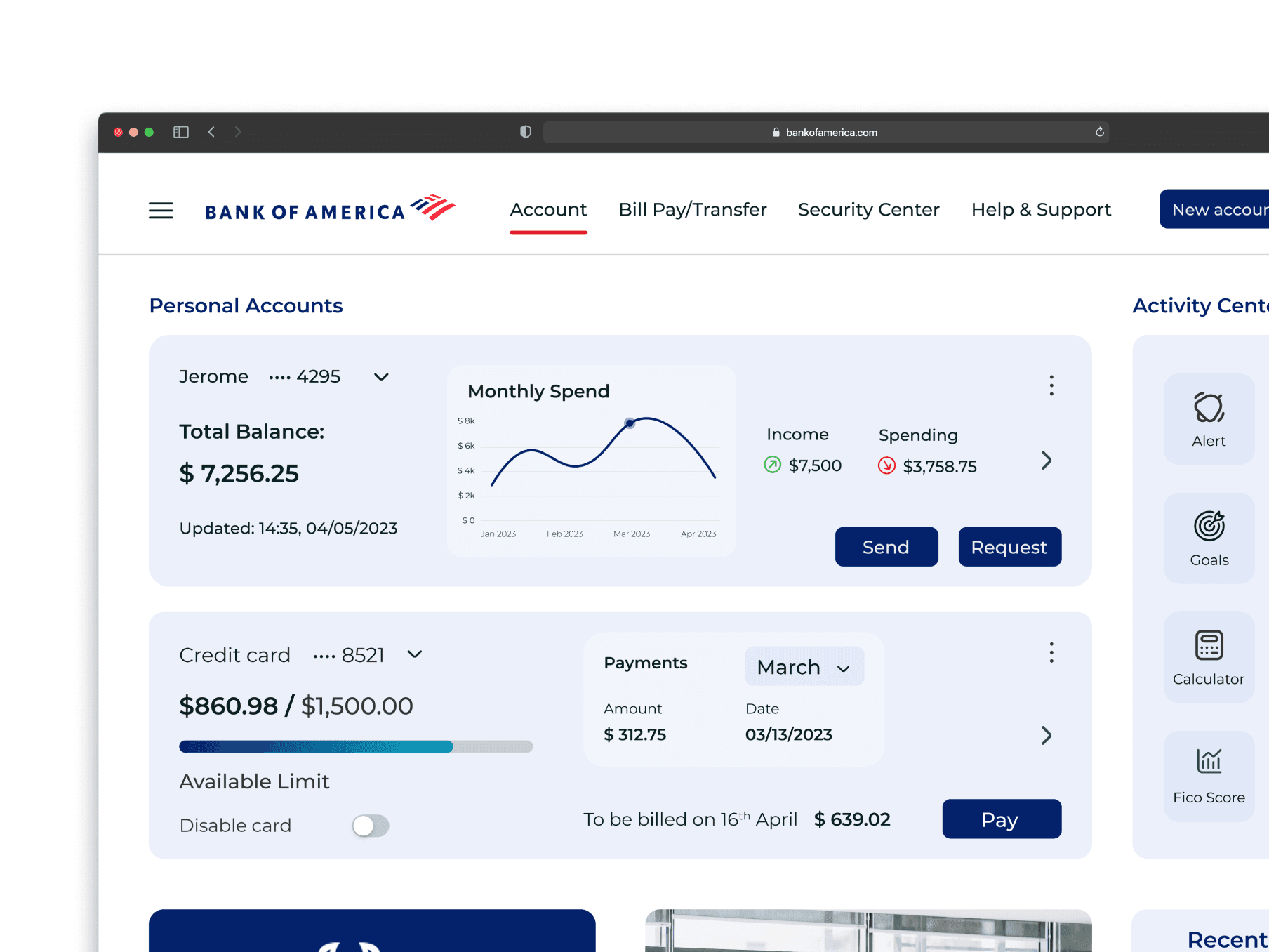
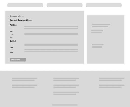
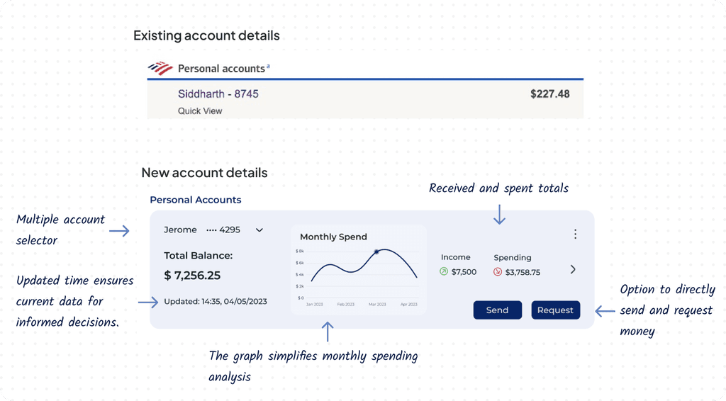
The account details section initially provided only basic balance information. However, through competitive analysis and user interviews, we discovered the importance of comprehensive account details readily accessible to users. To address this, we incorporated additional features such as updated dates, multiple account selection, send/request buttons, spending graphs, and informative summaries, ensuring users have a holistic view of their accounts with ease.
The account details section initially provided only basic balance information. However, through competitive analysis and user interviews, we discovered the importance of comprehensive account details readily accessible to users. To address this, we incorporated additional features such as updated dates, multiple account selection, send/request buttons, spending graphs, and informative summaries, ensuring users have a holistic view of their accounts with ease.
The account details section initially provided only basic balance information. However, through competitive analysis and user interviews, we discovered the importance of comprehensive account details readily accessible to users. To address this, we incorporated additional features such as updated dates, multiple account selection, send/request buttons, spending graphs, and informative summaries, ensuring users have a holistic view of their accounts with ease.
The account details section initially provided only basic balance information. However, through competitive analysis and user interviews, we discovered the importance of comprehensive account details readily accessible to users. To address this, we incorporated additional features such as updated dates, multiple account selection, send/request buttons, spending graphs, and informative summaries, ensuring users have a holistic view of their accounts with ease.
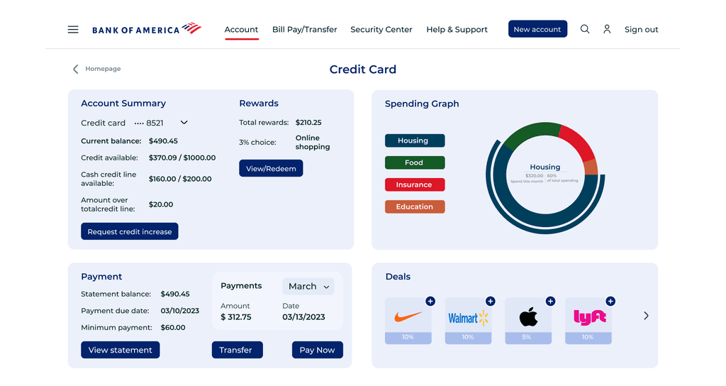
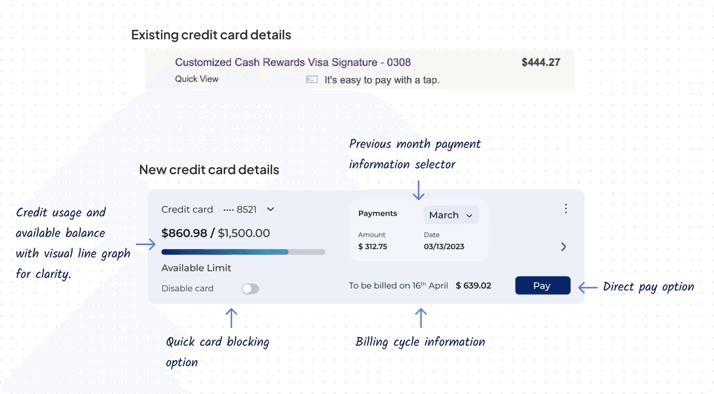
Credit card details
Credit card details
Credit card details
Credit card details
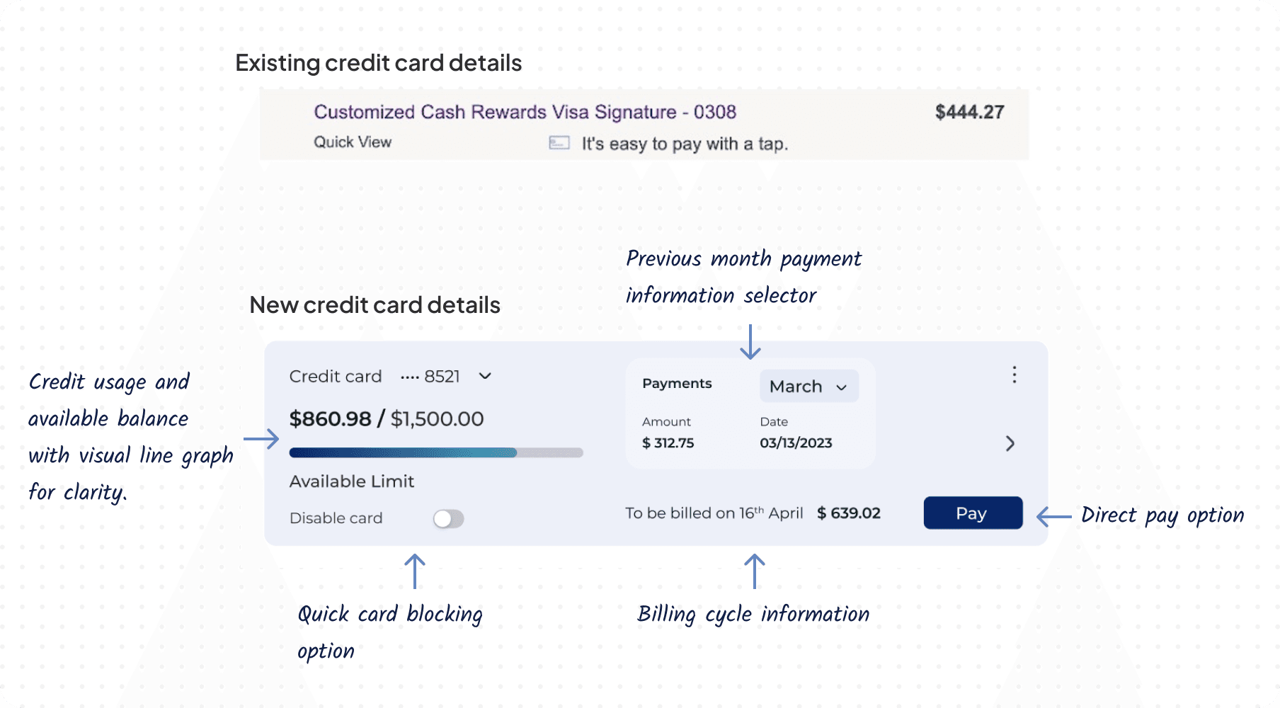
We've enhanced the credit card section to optimize user experience. In addition to credit usage on the homepage, users now have access to a comprehensive overview, including total credit limit and spending progress via a graphical representation. Furthermore, we've integrated key details such as billing dates and a feature to access previous billing information, ensuring greater clarity and convenience for our users.
We've enhanced the credit card section to optimize user experience. In addition to credit usage on the homepage, users now have access to a comprehensive overview, including total credit limit and spending progress via a graphical representation. Furthermore, we've integrated key details such as billing dates and a feature to access previous billing information, ensuring greater clarity and convenience for our users.
We've enhanced the credit card section to optimize user experience. In addition to credit usage on the homepage, users now have access to a comprehensive overview, including total credit limit and spending progress via a graphical representation. Furthermore, we've integrated key details such as billing dates and a feature to access previous billing information, ensuring greater clarity and convenience for our users.
We've enhanced the credit card section to optimize user experience. In addition to credit usage on the homepage, users now have access to a comprehensive overview, including total credit limit and spending progress via a graphical representation. Furthermore, we've integrated key details such as billing dates and a feature to access previous billing information, ensuring greater clarity and convenience for our users.
Information section
Information section
Information section
Information section
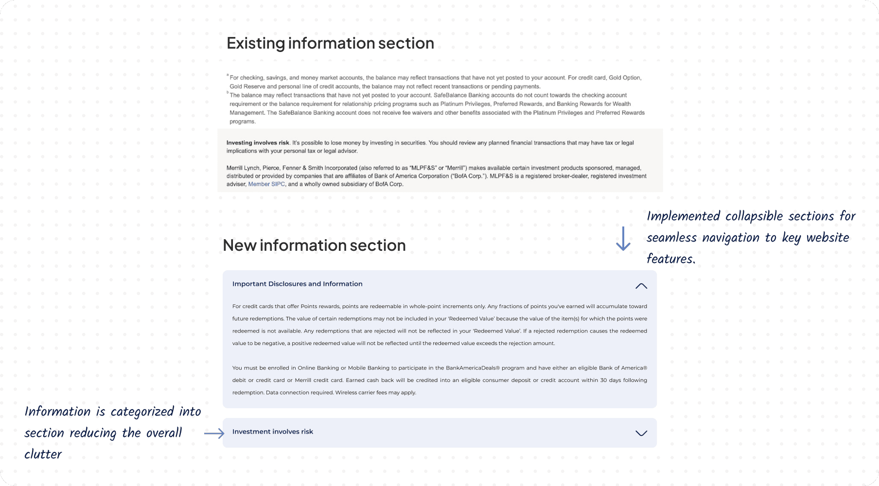
We've optimized the website's information section by categorizing content and introducing collapsible features. This not only enhances readability but also conserves valuable screen space, ensuring a smoother user experience across all pages.
We've optimized the website's information section by categorizing content and introducing collapsible features. This not only enhances readability but also conserves valuable screen space, ensuring a smoother user experience across all pages.
We've optimized the website's information section by categorizing content and introducing collapsible features. This not only enhances readability but also conserves valuable screen space, ensuring a smoother user experience across all pages.
We've optimized the website's information section by categorizing content and introducing collapsible features. This not only enhances readability but also conserves valuable screen space, ensuring a smoother user experience across all pages.
Footer
Footer
Footer
Footer
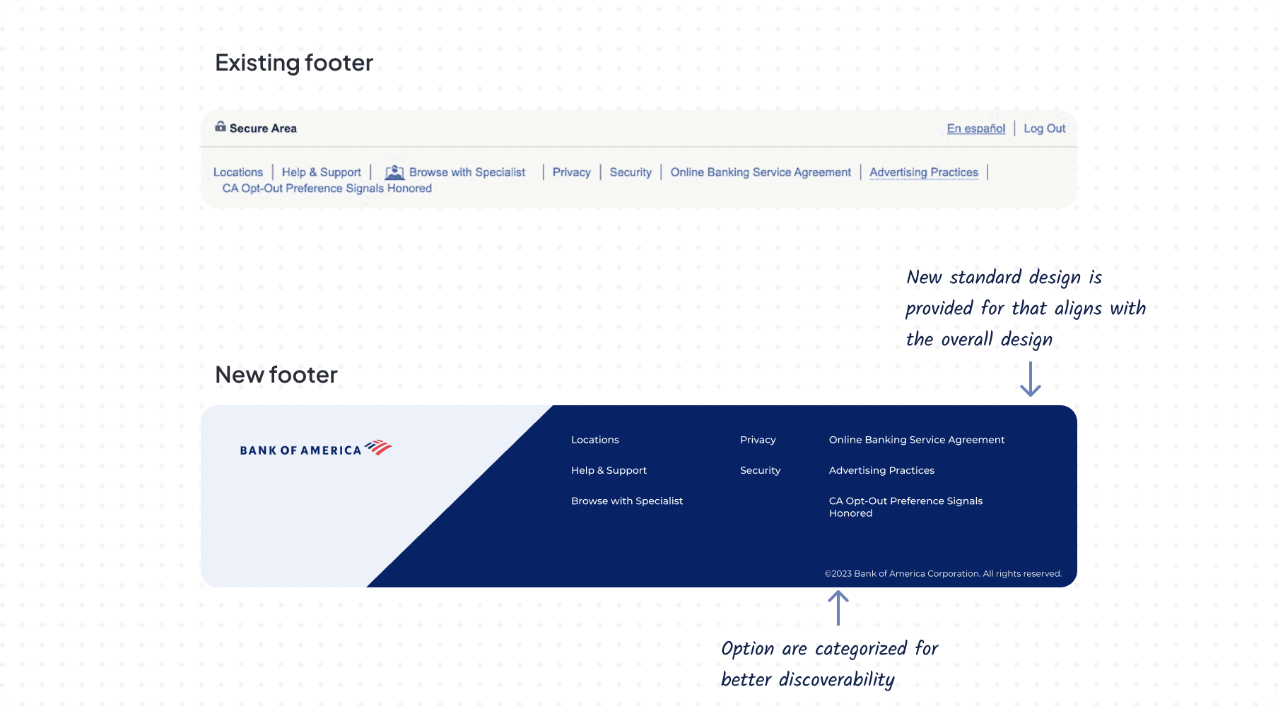
The previous footer lacked visual appeal and clear hierarchy, resulting in poor discoverability. We revamped it with a standardized design and established a clear hierarchy for its elements, enhancing both aesthetics and usability.
The previous footer lacked visual appeal and clear hierarchy, resulting in poor discoverability. We revamped it with a standardized design and established a clear hierarchy for its elements, enhancing both aesthetics and usability.
The previous footer lacked visual appeal and clear hierarchy, resulting in poor discoverability. We revamped it with a standardized design and established a clear hierarchy for its elements, enhancing both aesthetics and usability.
The previous footer lacked visual appeal and clear hierarchy, resulting in poor discoverability. We revamped it with a standardized design and established a clear hierarchy for its elements, enhancing both aesthetics and usability.
Other designs
Other designs
Other designs
Other designs


Cognitive walkthrough
Cognitive walkthrough
Cognitive walkthrough
Cognitive walkthrough
Prior to user testing, we conducted thorough cognitive walkthroughs, adopting different mindsets to explore user interaction pathways. Collaborating with university designers enhanced our evaluations, providing diverse perspectives and enriching our understanding.
Prior to user testing, we conducted thorough cognitive walkthroughs, adopting different mindsets to explore user interaction pathways. Collaborating with university designers enhanced our evaluations, providing diverse perspectives and enriching our understanding.
Prior to user testing, we conducted thorough cognitive walkthroughs, adopting different mindsets to explore user interaction pathways. Collaborating with university designers enhanced our evaluations, providing diverse perspectives and enriching our understanding.
Prior to user testing, we conducted thorough cognitive walkthroughs, adopting different mindsets to explore user interaction pathways. Collaborating with university designers enhanced our evaluations, providing diverse perspectives and enriching our understanding.


Result
Result
Result
Result
1
User testing revealed that over 80% of participants experienced improvements with the new designs.
User testing revealed that over 80% of participants experienced improvements with the new designs.
User testing revealed that over 80% of participants experienced improvements with the new designs.
User testing revealed that over 80% of participants experienced improvements with the new designs.
User testing revealed that over 80% of participants experienced improvements with the new designs.
2
1
Tasks were completed 70% faster compared to the existing website, attributed mainly to the enhanced discoverability of features in the new designs.
Tasks were completed 70% faster compared to the existing website, attributed mainly to the enhanced discoverability of features in the new designs.
Tasks were completed 70% faster compared to the existing website, attributed mainly to the enhanced discoverability of features in the new designs.
Tasks were completed 70% faster compared to the existing website, attributed mainly to the enhanced discoverability of features in the new designs.
Tasks were completed 70% faster compared to the existing website, attributed mainly to the enhanced discoverability of features in the new designs.
3
1
A common feedback from users was that the old website felt overwhelming, whereas the redesign is described as crisp and clear.
A common feedback from users was that the old website felt overwhelming, whereas the redesign is described as crisp and clear.
A common feedback from users was that the old website felt overwhelming, whereas the redesign is described as crisp and clear.
A common feedback from users was that the old website felt overwhelming, whereas the redesign is described as crisp and clear.
A common feedback from users was that the old website felt overwhelming, whereas the redesign is described as crisp and clear.
4
1
Users found navigation and task execution significantly easier with the redesigned interface.
Users found navigation and task execution significantly easier with the redesigned interface.
Users found navigation and task execution significantly easier with the redesigned interface.
Users found navigation and task execution significantly easier with the redesigned interface.
Users found navigation and task execution significantly easier with the redesigned interface.
As a result, we consider the redesign project a success based on the high level of user satisfaction achieved.
As a result, we consider the redesign project a success based on the high level of user satisfaction achieved.
As a result, we consider the redesign project a success based on the high level of user satisfaction achieved.
As a result, we consider the redesign project a success based on the high level of user satisfaction achieved.
As a result, we consider the redesign project a success based on the high level of user satisfaction achieved.
Recommendation
Recommendation
Recommendation
Recommendation
Recommendation
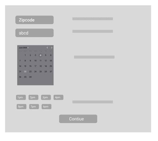
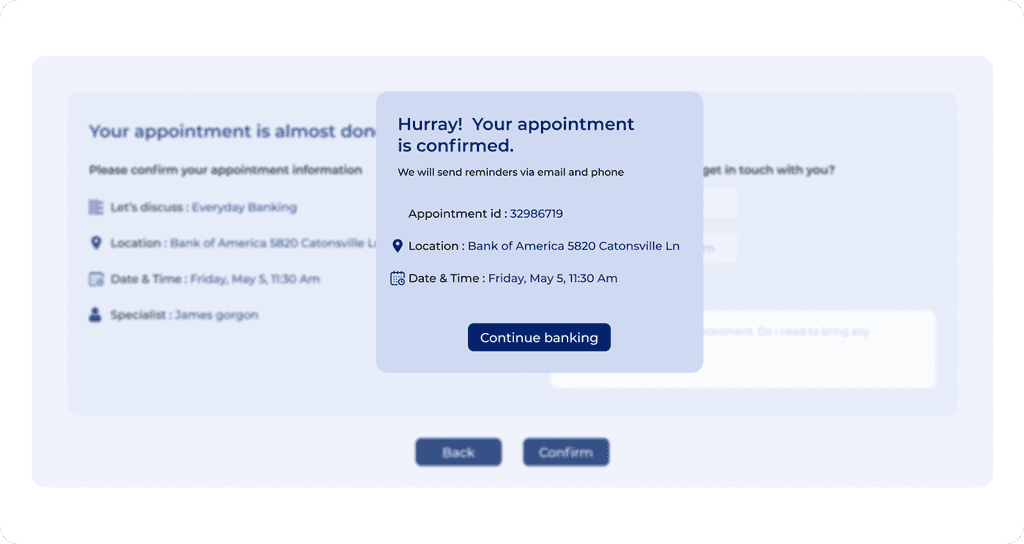
Given the time constraints of the project, our focus was primarily directed towards specific tasks, including enhancing the home page navigation, improving the viewing experience for account details and credit card information, and refining the appointment scheduling process.
Additionally, if time permitted, we would prioritize streamlining the money transfer feature, as its current functionality involves a lengthy process spanning multiple pages, which could potentially frustrate users.
Implementing these recommendations would not only enhance the overall user experience but also mitigate potential sources of user frustration.
Takeway
Takeway
Takeway
Takeway
This project taught me that designing websites isn't just about making them look nice – it's about making them easy and enjoyable for people to use. By involving users from the start and constantly testing and improving the design, we were able to create something that really met their needs. It showed me the importance of being flexible and open to change, as well as the power of collaboration and teamwork in achieving success. Overall, it emphasized the importance of putting users first and continually striving to make their digital experiences better.
This project taught me that designing websites isn't just about making them look nice – it's about making them easy and enjoyable for people to use. By involving users from the start and constantly testing and improving the design, we were able to create something that really met their needs. It showed me the importance of being flexible and open to change, as well as the power of collaboration and teamwork in achieving success. Overall, it emphasized the importance of putting users first and continually striving to make their digital experiences better.
This project taught me that designing websites isn't just about making them look nice – it's about making them easy and enjoyable for people to use. By involving users from the start and constantly testing and improving the design, we were able to create something that really met their needs. It showed me the importance of being flexible and open to change, as well as the power of collaboration and teamwork in achieving success. Overall, it emphasized the importance of putting users first and continually striving to make their digital experiences better.
This project taught me that designing websites isn't just about making them look nice – it's about making them easy and enjoyable for people to use. By involving users from the start and constantly testing and improving the design, we were able to create something that really met their needs. It showed me the importance of being flexible and open to change, as well as the power of collaboration and teamwork in achieving success. Overall, it emphasized the importance of putting users first and continually striving to make their digital experiences better.
Personas
These two personas were selected for different reasons: one to represent users with limited technical familiarity and the other to bring an advanced technological perspective. This diverse approach ensures that your redesign project considers a wide range of user experiences and technical needs, ultimately leading to a more inclusive and well-informed design.
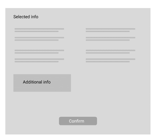
Low-Fidelity Wireframes
After identifying the key tasks, we initiated the design process by sketching out low-fidelity prototypes with pen and paper to lay the groundwork for the initial designs.
Medium-Fidelity Wireframes
After carefully considering the feedback garnered from the Low-Fidelity Wireframes, we implemented valuable changes and enhancements
High-Fidelity Design
Incorporating user research and feedback from initial designs, we developed a high-fidelity design addressing website issues and integrating desired features suggested by users for the BofA website.
Home page
Other designs
Cognitive walkthrough
Prior to user testing, we conducted thorough cognitive walkthroughs, adopting different mindsets to explore user interaction pathways. Collaborating with university designers enhanced our evaluations, providing diverse perspectives and enriching our understanding.
User Testing & Feedbacks
After completing the medium-fidelity design phase, we proceeded to conduct user testing with a select group of Bank of America users to gauge their reactions to the new designs. We facilitated a comprehensive walkthrough, allowing users to navigate through the interface and experience the changes firsthand. The feedback we received was overwhelmingly positive from 8 participants, indicating a strong affinity for the new features and options, despite lacking some high-fidelity details.
Among the highlights of the feedback were the users' appreciation for the added options and features. Additionally, valuable suggestions emerged, particularly regarding improvements to the designs. These included simplifying navigation for enhanced user experience and incorporating graphical representations to facilitate better comprehension of spending and other pertinent information.
This user testing phase not only affirmed the viability of our design direction but also provided invaluable insights for refining and enhancing the user experience further
Solutions
Significant attention was dedicated to the following designs, aimed at enhancing usability, improving cognitive recognition, and ensuring ease of use.
Navigation section
We noticed the navigation was overwhelming with numerous options, making it hard for users to find what they need. To fix this, we prioritized the main features and simplified the navigation, making it efficient and easy to use. Additional features are tucked away in a menu option, while the profile section is cleaned up with icons for easier identification.
Account details
The account details section initially provided only basic balance information. However, through competitive analysis and user interviews, we discovered the importance of comprehensive account details readily accessible to users. To address this, we incorporated additional features such as updated dates, multiple account selection, send/request buttons, spending graphs, and informative summaries, ensuring users have a holistic view of their accounts with ease.
Credit card details
We've enhanced the credit card section to optimize user experience. In addition to credit usage on the homepage, users now have access to a comprehensive overview, including total credit limit and spending progress via a graphical representation. Furthermore, we've integrated key details such as billing dates and a feature to access previous billing information, ensuring greater clarity and convenience for our users.
Information section
We've optimized the website's information section by categorizing content and introducing collapsible features. This not only enhances readability but also conserves valuable screen space, ensuring a smoother user experience across all pages.
Footer
The previous footer lacked visual appeal and clear hierarchy, resulting in poor discoverability. We revamped it with a standardized design and established a clear hierarchy for its elements, enhancing both aesthetics and usability.
Other designs