Overview
Overview
Overview
Overview
Goodreads, a prominent book-centric platform owned by Amazon, boasts millions of users worldwide. However, despite its extensive user base and rich features, the platform has faced criticism for its outdated design and usability issues. This project aims to address these concerns by undertaking a comprehensive overhaul of the Goodreads application, focusing on improving user experience, modernizing design elements, and enhancing community engagement features.
Goodreads, a prominent book-centric platform owned by Amazon, boasts millions of users worldwide. However, despite its extensive user base and rich features, the platform has faced criticism for its outdated design and usability issues. This project aims to address these concerns by undertaking a comprehensive overhaul of the Goodreads application, focusing on improving user experience, modernizing design elements, and enhancing community engagement features.
Goodreads, a prominent book-centric platform owned by Amazon, boasts millions of users worldwide. However, despite its extensive user base and rich features, the platform has faced criticism for its outdated design and usability issues. This project aims to address these concerns by undertaking a comprehensive overhaul of the Goodreads application, focusing on improving user experience, modernizing design elements, and enhancing community engagement features.
Goodreads, a prominent book-centric platform owned by Amazon, boasts millions of users worldwide. However, despite its extensive user base and rich features, the platform has faced criticism for its outdated design and usability issues. This project aims to address these concerns by undertaking a comprehensive overhaul of the Goodreads application, focusing on improving user experience, modernizing design elements, and enhancing community engagement features.
Problem statement
Problem statement
Problem statement
Problem statement
Despite its popularity, Goodreads faces user dissatisfaction due to its outdated design and difficult navigation. Users struggle to explore the platform, causing frustration and lowering satisfaction. Additionally, the lack of modern design and personalized experiences worsens these issues, reducing user engagement and retention.
Despite its popularity, Goodreads faces user dissatisfaction due to its outdated design and difficult navigation. Users struggle to explore the platform, causing frustration and lowering satisfaction. Additionally, the lack of modern design and personalized experiences worsens these issues, reducing user engagement and retention.
Despite its popularity, Goodreads faces user dissatisfaction due to its outdated design and difficult navigation. Users struggle to explore the platform, causing frustration and lowering satisfaction. Additionally, the lack of modern design and personalized experiences worsens these issues, reducing user engagement and retention.
Despite its popularity, Goodreads faces user dissatisfaction due to its outdated design and difficult navigation. Users struggle to explore the platform, causing frustration and lowering satisfaction. Additionally, the lack of modern design and personalized experiences worsens these issues, reducing user engagement and retention.
Goal
Goal
Goal
1
Enhance the app's aesthetics to create a modern and visually appealing interface.
Enhance the app's aesthetics to create a modern and visually appealing interface.
Enhance the app's aesthetics to create a modern and visually appealing interface.
2
Revamp the layout for improved accessibility and navigation.
Revamp the layout for improved accessibility and navigation.
Revamp the layout for improved accessibility and navigation.
3
Refine the hierarchy of information to prioritize key details.
Refine the hierarchy of information to prioritize key details.
Refine the hierarchy of information to prioritize key details.
4
Improve the presentation of book information for enhanced readability and engagement.
Improve the presentation of book information for enhanced readability and engagement.
Improve the presentation of book information for enhanced readability and engagement.
These are some proposed enhancements for the app aimed at improving its usability.
These are some proposed enhancements for the app aimed at improving its usability.
These are some proposed enhancements for the app aimed at improving its usability.
These are some proposed enhancements for the app aimed at improving its usability.
What users feel
What users feel
What users feel
What users feel
Upon thorough exploration of the app and carefully reading through user comments, insight into the sentiments and areas where users feel there are gaps was gained. Reviews from users showcase a variety of experiences, ranging from praise for its book discovery features to frustrations with navigation issues and occasional bugs. Below are selected reviews provided by users regarding the Goodreads app
Upon thorough exploration of the app and carefully reading through user comments, insight into the sentiments and areas where users feel there are gaps was gained. Reviews from users showcase a variety of experiences, ranging from praise for its book discovery features to frustrations with navigation issues and occasional bugs. Below are selected reviews provided by users regarding the Goodreads app
Upon thorough exploration of the app and carefully reading through user comments, insight into the sentiments and areas where users feel there are gaps was gained. Reviews from users showcase a variety of experiences, ranging from praise for its book discovery features to frustrations with navigation issues and occasional bugs. Below are selected reviews provided by users regarding the Goodreads app
Upon thorough exploration of the app and carefully reading through user comments, insight into the sentiments and areas where users feel there are gaps was gained. Reviews from users showcase a variety of experiences, ranging from praise for its book discovery features to frustrations with navigation issues and occasional bugs. Below are selected reviews provided by users regarding the Goodreads app
Design Process
Design Process
Design Process
Design Process
To gain a deeper understanding of user frustration, a comprehensive research approach was initiated. Firstly, a detailed survey was conducted to gather general feedback from users, aiming to pinpoint specific pain points. Additionally, personas were crafted to segment the user base and understand their diverse needs and usage patterns within the Goodreads app.
Furthermore, in-depth user interviews were conducted to delve deeper into individual experiences and uncover insights into the nuances of app usage. By employing this multi-faceted research strategy, valuable insights were uncovered to inform design decisions and enhance the overall user experience of the Goodreads app.
Survey
Survey
Survey
Survey
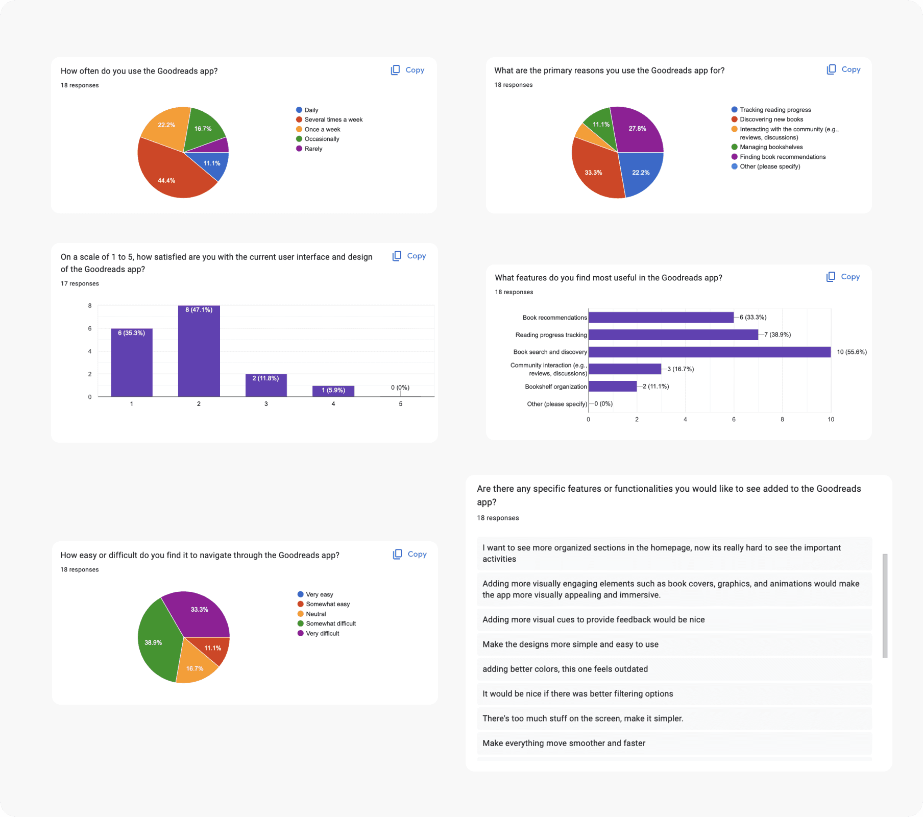
The survey, with 18 responses, highlighted key insights guiding our app redesign
The survey, with 18 responses, highlighted key insights guiding our app redesign
The survey, with 18 responses, highlighted key insights guiding our app redesign
The survey, with 18 responses, highlighted key insights guiding our app redesign
1
Usage pattern
Discovering new books, tracking reading progress, and finding book recommendations are the primary uses of the Goodreads app. Users rely heavily on the app for book-related activities, indicating a strong interest in reading and book discovery.
1
Usage pattern
Discovering new books, tracking reading progress, and finding book recommendations are the primary uses of the Goodreads app. Users rely heavily on the app for book-related activities, indicating a strong interest in reading and book discovery.
1
Usage pattern
Discovering new books, tracking reading progress, and finding book recommendations are the primary uses of the Goodreads app. Users rely heavily on the app for book-related activities, indicating a strong interest in reading and book discovery.
1
Usage pattern
Discovering new books, tracking reading progress, and finding book recommendations are the primary uses of the Goodreads app. Users rely heavily on the app for book-related activities, indicating a strong interest in reading and book discovery.
1
Usage pattern
Discovering new books, tracking reading progress, and finding book recommendations are the primary uses of the Goodreads app. Users rely heavily on the app for book-related activities, indicating a strong interest in reading and book discovery.
1
Usage pattern
Discovering new books, tracking reading progress, and finding book recommendations are the primary uses of the Goodreads app. Users rely heavily on the app for book-related activities, indicating a strong interest in reading and book discovery.
2
User Satisfaction
Over 80% of users expressed dissatisfaction with the app's user interface. Users find the current interface lacking in terms of usability and aesthetics, which impacts their overall experience. This dissatisfaction aligns with negative feedback found in Google reviews.
2
User Satisfaction
Over 80% of users expressed dissatisfaction with the app's user interface. Users find the current interface lacking in terms of usability and aesthetics, which impacts their overall experience. This dissatisfaction aligns with negative feedback found in Google reviews.
2
User Satisfaction
Over 80% of users expressed dissatisfaction with the app's user interface. Users find the current interface lacking in terms of usability and aesthetics, which impacts their overall experience. This dissatisfaction aligns with negative feedback found in Google reviews.
2
User Satisfaction
Over 80% of users expressed dissatisfaction with the app's user interface. Users find the current interface lacking in terms of usability and aesthetics, which impacts their overall experience. This dissatisfaction aligns with negative feedback found in Google reviews.
2
User Satisfaction
Over 80% of users expressed dissatisfaction with the app's user interface. Users find the current interface lacking in terms of usability and aesthetics, which impacts their overall experience. This dissatisfaction aligns with negative feedback found in Google reviews.
2
User Satisfaction
Over 80% of users expressed dissatisfaction with the app's user interface. Users find the current interface lacking in terms of usability and aesthetics, which impacts their overall experience. This dissatisfaction aligns with negative feedback found in Google reviews.
3
Popular feature
The book search and discovery feature is the most utilized within the application. This indicates a strong desire among users to explore new books and authors, highlighting the importance of this feature in the app's functionality.
3
Popular feature
The book search and discovery feature is the most utilized within the application. This indicates a strong desire among users to explore new books and authors, highlighting the importance of this feature in the app's functionality.
3
Popular feature
The book search and discovery feature is the most utilized within the application. This indicates a strong desire among users to explore new books and authors, highlighting the importance of this feature in the app's functionality.
3
Popular feature
The book search and discovery feature is the most utilized within the application. This indicates a strong desire among users to explore new books and authors, highlighting the importance of this feature in the app's functionality.
3
Popular feature
The book search and discovery feature is the most utilized within the application. This indicates a strong desire among users to explore new books and authors, highlighting the importance of this feature in the app's functionality.
3
Popular feature
The book search and discovery feature is the most utilized within the application. This indicates a strong desire among users to explore new books and authors, highlighting the importance of this feature in the app's functionality.
4
Usability Challenges
More than 70% of users find it difficult to navigate through the app for various tasks. These navigation difficulties hinder users' ability to fully engage with the app and achieve their desired tasks efficiently.
4
Usability Challenges
More than 70% of users find it difficult to navigate through the app for various tasks. These navigation difficulties hinder users' ability to fully engage with the app and achieve their desired tasks efficiently.
4
Usability Challenges
More than 70% of users find it difficult to navigate through the app for various tasks. These navigation difficulties hinder users' ability to fully engage with the app and achieve their desired tasks efficiently.
4
Usability Challenges
More than 70% of users find it difficult to navigate through the app for various tasks. These navigation difficulties hinder users' ability to fully engage with the app and achieve their desired tasks efficiently.
4
Usability Challenges
More than 70% of users find it difficult to navigate through the app for various tasks. These navigation difficulties hinder users' ability to fully engage with the app and achieve their desired tasks efficiently.
4
Usability Challenges
More than 70% of users find it difficult to navigate through the app for various tasks. These navigation difficulties hinder users' ability to fully engage with the app and achieve their desired tasks efficiently.
These insights from the survey serve as a valuable foundation for enhancing the app's design. By understanding users' motivations, dissatisfaction, and usage patterns, a clear understanding of their needs and preferences is gained, guiding in crafting a more user-friendly and intuitive experience.
These insights from the survey serve as a valuable foundation for enhancing the app's design. By understanding users' motivations, dissatisfaction, and usage patterns, a clear understanding of their needs and preferences is gained, guiding in crafting a more user-friendly and intuitive experience.
These insights from the survey serve as a valuable foundation for enhancing the app's design. By understanding users' motivations, dissatisfaction, and usage patterns, a clear understanding of their needs and preferences is gained, guiding in crafting a more user-friendly and intuitive experience.
These insights from the survey serve as a valuable foundation for enhancing the app's design. By understanding users' motivations, dissatisfaction, and usage patterns, a clear understanding of their needs and preferences is gained, guiding in crafting a more user-friendly and intuitive experience.
User interviews
User interviews
User interviews
User interviews

Key questions posed and the resulting insights:
Key questions posed and the resulting insights:
Key questions posed and the resulting insights:
Key questions posed and the resulting insights:
1
Which specific features or sections of the Goodreads app do you find confusing or difficult to use, and why?
Users find the homepage confusing, with main activities and recommendations displayed inconsistently and without order. The absence of a dedicated section for recommendations makes it hard to access them, resulting in endless scrolling
2
Can you recall a recent time when you struggled to find something on the app? What made it difficult?
Users struggle to locate the reading challenge section as it's not readily available upfront, requiring them to navigate around to find it. This particularly impacts first-time users, who suggest that easier access to this feature would enhance their experience.
3
How easy is it to navigate the Goodreads app? Any areas needing improvement?
The navigation isn't as intuitive as one would hope. While familiarity improves the experience, there's still considerable room for improvement. The current arrangement lacks user-friendliness and could benefit from enhancements.
4
Does the app accommodate different reading preferences well enough, in your opinion?
It offers a vast array of genres to cater to every taste imaginable. With such a diverse selection, users have endless options to explore, making it convenient for individuals with varying preferences to discover something they'll enjoy.
5
What changes would you suggest to make the app easier to use?
The app has an outdated feel to it, with dull and unappealing colors. Aesthetically, it falls short of being visually pleasing. Enhancing its design could significantly improve the user experience.
5
What changes would you suggest to make the app easier to use?
The app has an outdated feel to it, with dull and unappealing colors. Aesthetically, it falls short of being visually pleasing. Enhancing its design could significantly improve the user experience.
5
What changes would you suggest to make the app easier to use?
The app has an outdated feel to it, with dull and unappealing colors. Aesthetically, it falls short of being visually pleasing. Enhancing its design could significantly improve the user experience.
5
What changes would you suggest to make the app easier to use?
The app has an outdated feel to it, with dull and unappealing colors. Aesthetically, it falls short of being visually pleasing. Enhancing its design could significantly improve the user experience.
5
What changes would you suggest to make the app easier to use?
The app has an outdated feel to it, with dull and unappealing colors. Aesthetically, it falls short of being visually pleasing. Enhancing its design could significantly improve the user experience.
5
What changes would you suggest to make the app easier to use?
The app has an outdated feel to it, with dull and unappealing colors. Aesthetically, it falls short of being visually pleasing. Enhancing its design could significantly improve the user experience.
Persona
Persona
Persona
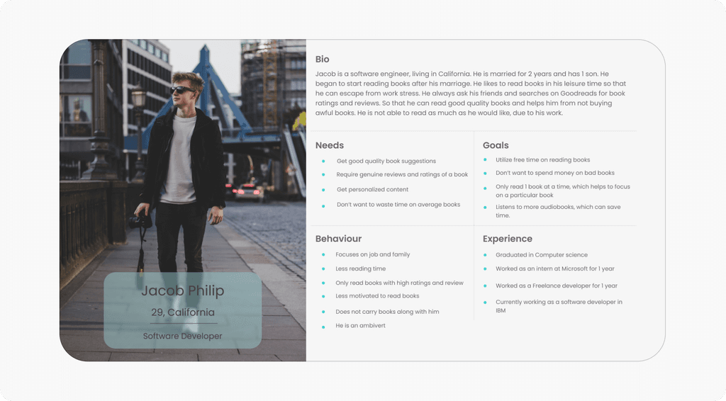
Created two distinct user personas tailored to different age groups, each representing unique needs and preferences. This approach facilitates a deeper understanding of evolving user needs, highlighting the nuanced differences between age groups and their respective requirements.
Created two distinct user personas tailored to different age groups, each representing unique needs and preferences. This approach facilitates a deeper understanding of evolving user needs, highlighting the nuanced differences between age groups and their respective requirements.
Created two distinct user personas tailored to different age groups, each representing unique needs and preferences. This approach facilitates a deeper understanding of evolving user needs, highlighting the nuanced differences between age groups and their respective requirements.

Pain points
Pain points
Pain points
Pain points

Information architecture
Information architecture
Information architecture

Developed an information architecture to visualize how various screens align with different user tasks, providing an overview of available features. Through this process, it became evident that recommendations and discovery options were crucial for users, yet not easily accessible. This insight guided design decisions for necessary improvements.
Developed an information architecture to visualize how various screens align with different user tasks, providing an overview of available features. Through this process, it became evident that recommendations and discovery options were crucial for users, yet not easily accessible. This insight guided design decisions for necessary improvements.
Developed an information architecture to visualize how various screens align with different user tasks, providing an overview of available features. Through this process, it became evident that recommendations and discovery options were crucial for users, yet not easily accessible. This insight guided design decisions for necessary improvements.
Added a new recommendation section to the top of the homepage for easier access.
Added a new recommendation section to the top of the homepage for easier access.
Added a new recommendation section to the top of the homepage for easier access.

Medium-Fidelity Designs
Medium-Fidelity Designs
Medium-Fidelity Designs
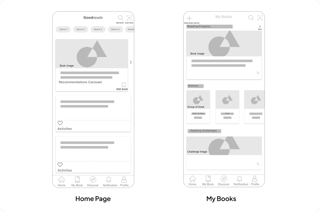
Utilizing research data, medium-fidelity designs were crafted to address issues by prioritizing user needs and adopting a user-centric approach.
Utilizing research data, medium-fidelity designs were crafted to address issues by prioritizing user needs and adopting a user-centric approach.
Utilizing research data, medium-fidelity designs were crafted to address issues by prioritizing user needs and adopting a user-centric approach.
High-Fidelity Design
High-Fidelity Design
High-Fidelity Design

Solutions
Solutions
Solutions
Significant attention was devoted to enhancing the main pages of the GoodReads app. The entire design underwent a transformation, embracing a modern aesthetic with improved color schemes and design elements. Moreover, solutions were meticulously tailored to address user pain points identified during the research phase, ensuring alignment with their needs and requirements.
Significant attention was devoted to enhancing the main pages of the GoodReads app. The entire design underwent a transformation, embracing a modern aesthetic with improved color schemes and design elements. Moreover, solutions were meticulously tailored to address user pain points identified during the research phase, ensuring alignment with their needs and requirements.
Significant attention was devoted to enhancing the main pages of the GoodReads app. The entire design underwent a transformation, embracing a modern aesthetic with improved color schemes and design elements. Moreover, solutions were meticulously tailored to address user pain points identified during the research phase, ensuring alignment with their needs and requirements.
Home page
Home page
Home page
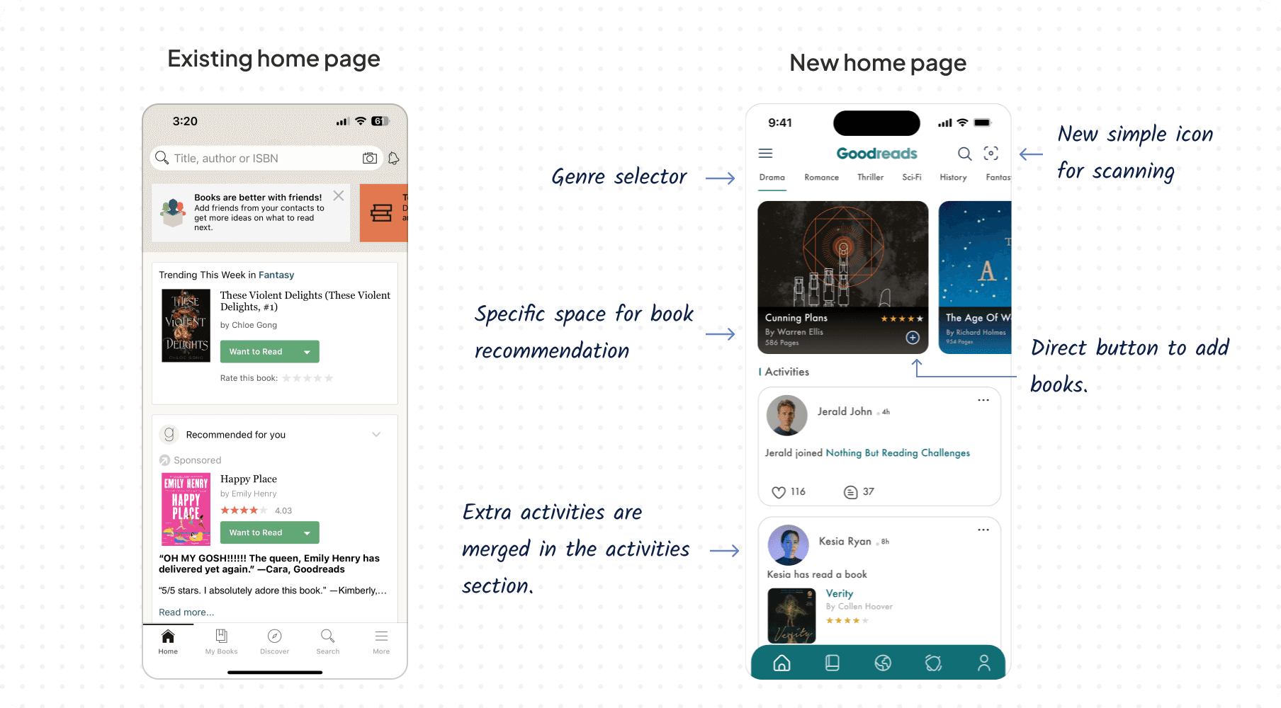
The previous home page was cluttered with various types of information, such as book recommendations and user activities, without any clear organization or grouping. This resulted in endless scrolling for users. In the redesigned version, the home page is divided into distinct sections for recommendations and activities. This separation makes it easier for users to find book recommendations, which was their primary requirement, while still accessing different activity information.
The previous home page was cluttered with various types of information, such as book recommendations and user activities, without any clear organization or grouping. This resulted in endless scrolling for users. In the redesigned version, the home page is divided into distinct sections for recommendations and activities. This separation makes it easier for users to find book recommendations, which was their primary requirement, while still accessing different activity information.
The previous home page was cluttered with various types of information, such as book recommendations and user activities, without any clear organization or grouping. This resulted in endless scrolling for users. In the redesigned version, the home page is divided into distinct sections for recommendations and activities. This separation makes it easier for users to find book recommendations, which was their primary requirement, while still accessing different activity information.
My books page
My books page
My books page
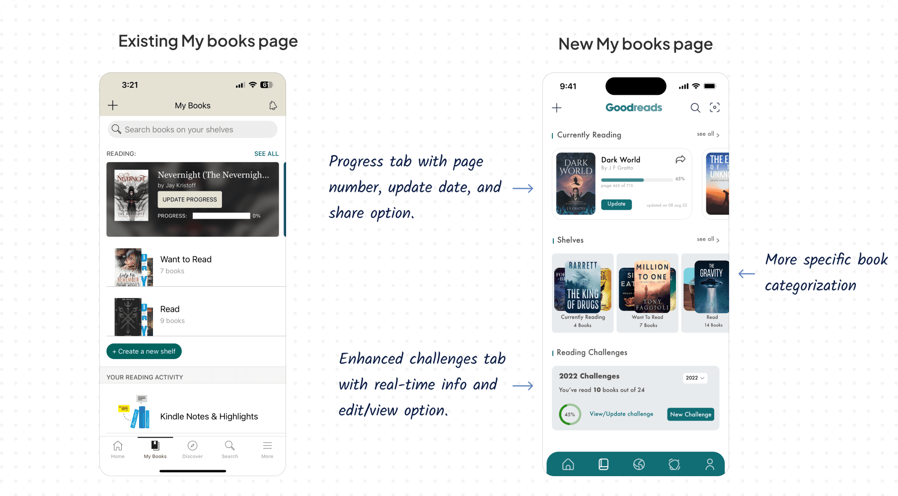
The progress bar underwent a redesign to match the new aesthetic seamlessly. Additional details were integrated into the reading book section, providing users with essential information at a glance. Enhancements were made to the shelves section for improved discoverability. Notably, the challenges section was elevated in priority and made more accessible, addressing a previous design deficiency.
The progress bar underwent a redesign to match the new aesthetic seamlessly. Additional details were integrated into the reading book section, providing users with essential information at a glance. Enhancements were made to the shelves section for improved discoverability. Notably, the challenges section was elevated in priority and made more accessible, addressing a previous design deficiency.
The progress bar underwent a redesign to match the new aesthetic seamlessly. Additional details were integrated into the reading book section, providing users with essential information at a glance. Enhancements were made to the shelves section for improved discoverability. Notably, the challenges section was elevated in priority and made more accessible, addressing a previous design deficiency.
Discover page
Discover page
Discover page
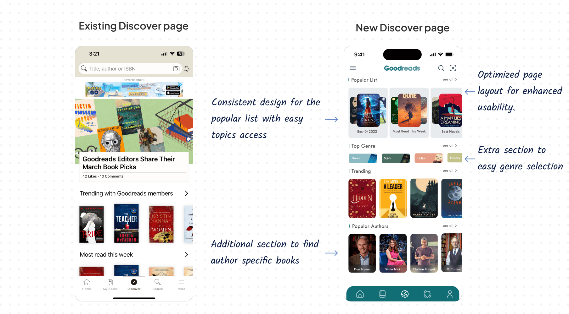
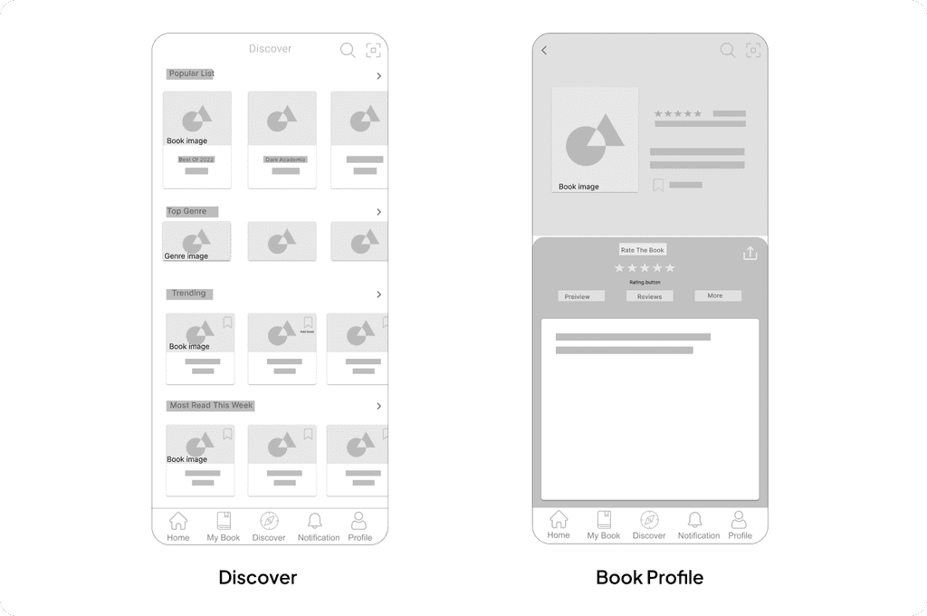
The previous design left a lot of space underutilized. In the new design, these spaces have been utilized effectively to offer users a wider selection of categories, including various genres, authors, and types of books. This enhancement simplifies the filtering process, allowing users to navigate through books more seamlessly.
The previous design left a lot of space underutilized. In the new design, these spaces have been utilized effectively to offer users a wider selection of categories, including various genres, authors, and types of books. This enhancement simplifies the filtering process, allowing users to navigate through books more seamlessly.
The previous design left a lot of space underutilized. In the new design, these spaces have been utilized effectively to offer users a wider selection of categories, including various genres, authors, and types of books. This enhancement simplifies the filtering process, allowing users to navigate through books more seamlessly.
Book profile page
Book profile page
Book profile page
In the old design, inconsistent icon sizes wasted space. In the new design, icons are consolidated into a single section for preview, reviews, and more. Additional book details are included, enhancing user understanding, with the preview offering a quick overview of the book's content for efficient browsing.
In the old design, inconsistent icon sizes wasted space. In the new design, icons are consolidated into a single section for preview, reviews, and more. Additional book details are included, enhancing user understanding, with the preview offering a quick overview of the book's content for efficient browsing.
In the old design, inconsistent icon sizes wasted space. In the new design, icons are consolidated into a single section for preview, reviews, and more. Additional book details are included, enhancing user understanding, with the preview offering a quick overview of the book's content for efficient browsing.
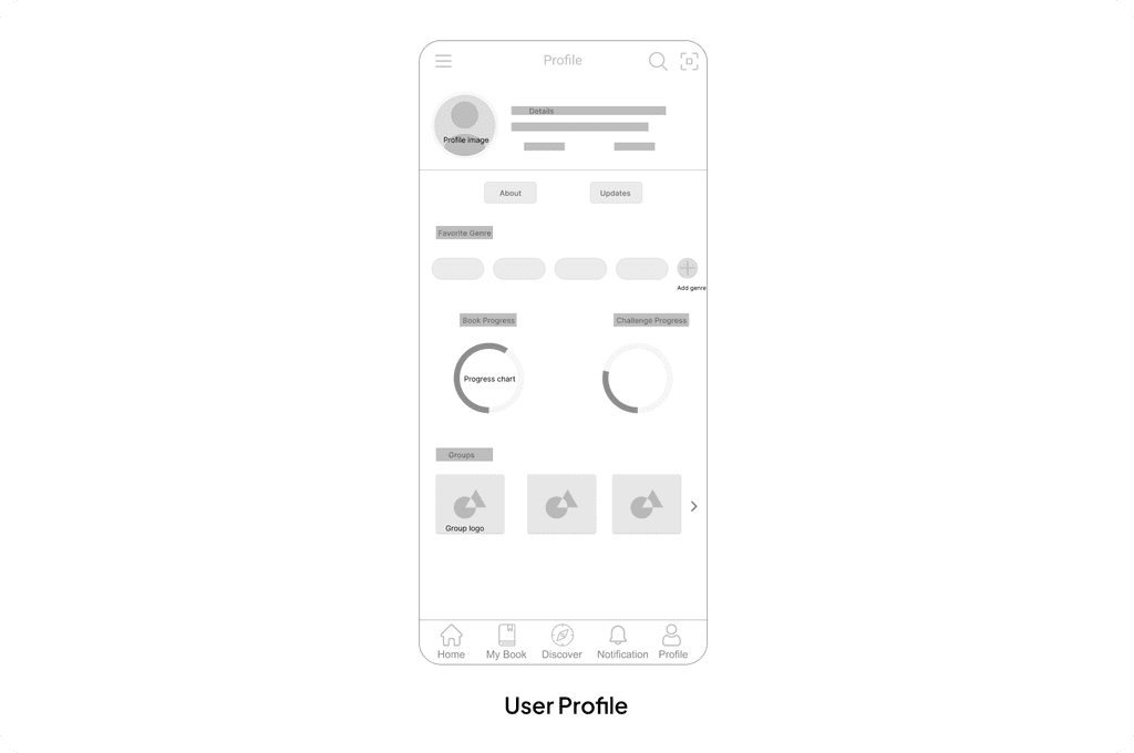
User profile page
User profile page
User profile page
The previous design lacked proper hierarchy, making it difficult to distinguish between different options on the page. The new design improves hierarchy for better discoverability, utilizing spacing effectively to achieve a clean and clutter-free layout. Additionally, user progress and group information are conveniently provided for easy access and use.
The previous design lacked proper hierarchy, making it difficult to distinguish between different options on the page. The new design improves hierarchy for better discoverability, utilizing spacing effectively to achieve a clean and clutter-free layout. Additionally, user progress and group information are conveniently provided for easy access and use.
The previous design lacked proper hierarchy, making it difficult to distinguish between different options on the page. The new design improves hierarchy for better discoverability, utilizing spacing effectively to achieve a clean and clutter-free layout. Additionally, user progress and group information are conveniently provided for easy access and use.
Result
Result
Result
1
Users unanimously praised the modern design for its enhanced aesthetics and appeal.
Users unanimously praised the modern design for its enhanced aesthetics and appeal.
Users unanimously praised the modern design for its enhanced aesthetics and appeal.
2
The redesign facilitated easy access to the recommendation tab, greatly improving content discovery.
The redesign facilitated easy access to the recommendation tab, greatly improving content discovery.
The redesign facilitated easy access to the recommendation tab, greatly improving content discovery.
3
Clearer, less cluttered screens resulted in smoother navigation and improved usability.
Clearer, less cluttered screens resulted in smoother navigation and improved usability.
Clearer, less cluttered screens resulted in smoother navigation and improved usability.
4
The modernized design not only improved visual appeal but also enhanced the overall user experience.
The modernized design not only improved visual appeal but also enhanced the overall user experience.
The modernized design not only improved visual appeal but also enhanced the overall user experience.
Feedback confirmed the redesign positively impacted user interactions, making the app more intuitive.
Feedback confirmed the redesign positively impacted user interactions, making the app more intuitive.
Feedback confirmed the redesign positively impacted user interactions, making the app more intuitive.
Takeway
Takeway
Takeway
This project has been an enriching journey, providing deep insights into the nuanced reading habits and preferences of diverse users. As someone who doesn't immerse myself in books extensively, it was enlightening to explore how individuals interact with reading applications. The user testing phase was especially fulfilling, as it validated the significant impact our redesigned interface can have on enhancing user engagement and satisfaction. It reinforced my belief in the power of user-centered design to transform the digital reading experience for all.
This project has been an enriching journey, providing deep insights into the nuanced reading habits and preferences of diverse users. As someone who doesn't immerse myself in books extensively, it was enlightening to explore how individuals interact with reading applications. The user testing phase was especially fulfilling, as it validated the significant impact our redesigned interface can have on enhancing user engagement and satisfaction. It reinforced my belief in the power of user-centered design to transform the digital reading experience for all.
This project has been an enriching journey, providing deep insights into the nuanced reading habits and preferences of diverse users. As someone who doesn't immerse myself in books extensively, it was enlightening to explore how individuals interact with reading applications. The user testing phase was especially fulfilling, as it validated the significant impact our redesigned interface can have on enhancing user engagement and satisfaction. It reinforced my belief in the power of user-centered design to transform the digital reading experience for all.
Persona
Created two distinct user personas tailored to different age groups, each representing unique needs and preferences. This approach facilitates a deeper understanding of evolving user needs, highlighting the nuanced differences between age groups and their respective requirements.
Information architecture
Developed an information architecture to visualize how various screens align with different user tasks, providing an overview of available features. Through this process, it became evident that recommendations and discovery options were crucial for users, yet not easily accessible. This insight guided design decisions for necessary improvements.
Added a new recommendation section to the top of the homepage for easier access.
High-Fidelity Design
Incorporating user research and feedback from initial designs, we developed a high-fidelity design addressing website issues and integrating desired features suggested by users for the BofA website.
Home page
Medium-Fidelity Wireframes
Utilizing research data, medium-fidelity designs were crafted to address issues by prioritizing user needs and adopting a user-centric approach.
Solutions
Significant attention was devoted to enhancing the main pages of the GoodReads app. The entire design underwent a transformation, embracing a modern aesthetic with improved color schemes and design elements. Moreover, solutions were meticulously tailored to address user pain points identified during the research phase, ensuring alignment with their needs and requirements.
Home page
The previous home page was cluttered with various types of information, such as book recommendations and user activities, without any clear organization or grouping. This resulted in endless scrolling for users. In the redesigned version, the home page is divided into distinct sections for recommendations and activities. This separation makes it easier for users to find book recommendations, which was their primary requirement, while still accessing different activity information.
My books page
The progress bar underwent a redesign to match the new aesthetic seamlessly. Additional details were integrated into the reading book section, providing users with essential information at a glance. Enhancements were made to the shelves section for improved discoverability. Notably, the challenges section was elevated in priority and made more accessible, addressing a previous design deficiency.
Discover page
The previous design left a lot of space underutilized. In the new design, these spaces have been utilized effectively to offer users a wider selection of categories, including various genres, authors, and types of books. This enhancement simplifies the filtering process, allowing users to navigate through books more seamlessly.
Book profile page
In the old design, inconsistent icon sizes wasted space. In the new design, icons are consolidated into a single section for preview, reviews, and more. Additional book details are included, enhancing user understanding, with the preview offering a quick overview of the book's content for efficient browsing.
User profile page
The previous design lacked proper hierarchy, making it difficult to distinguish between different options on the page. The new design improves hierarchy for better discoverability, utilizing spacing effectively to achieve a clean and clutter-free layout. Additionally, user progress and group information are conveniently provided for easy access and use.