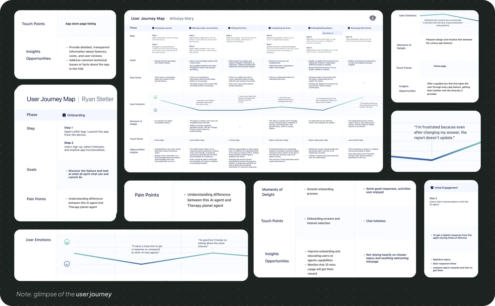
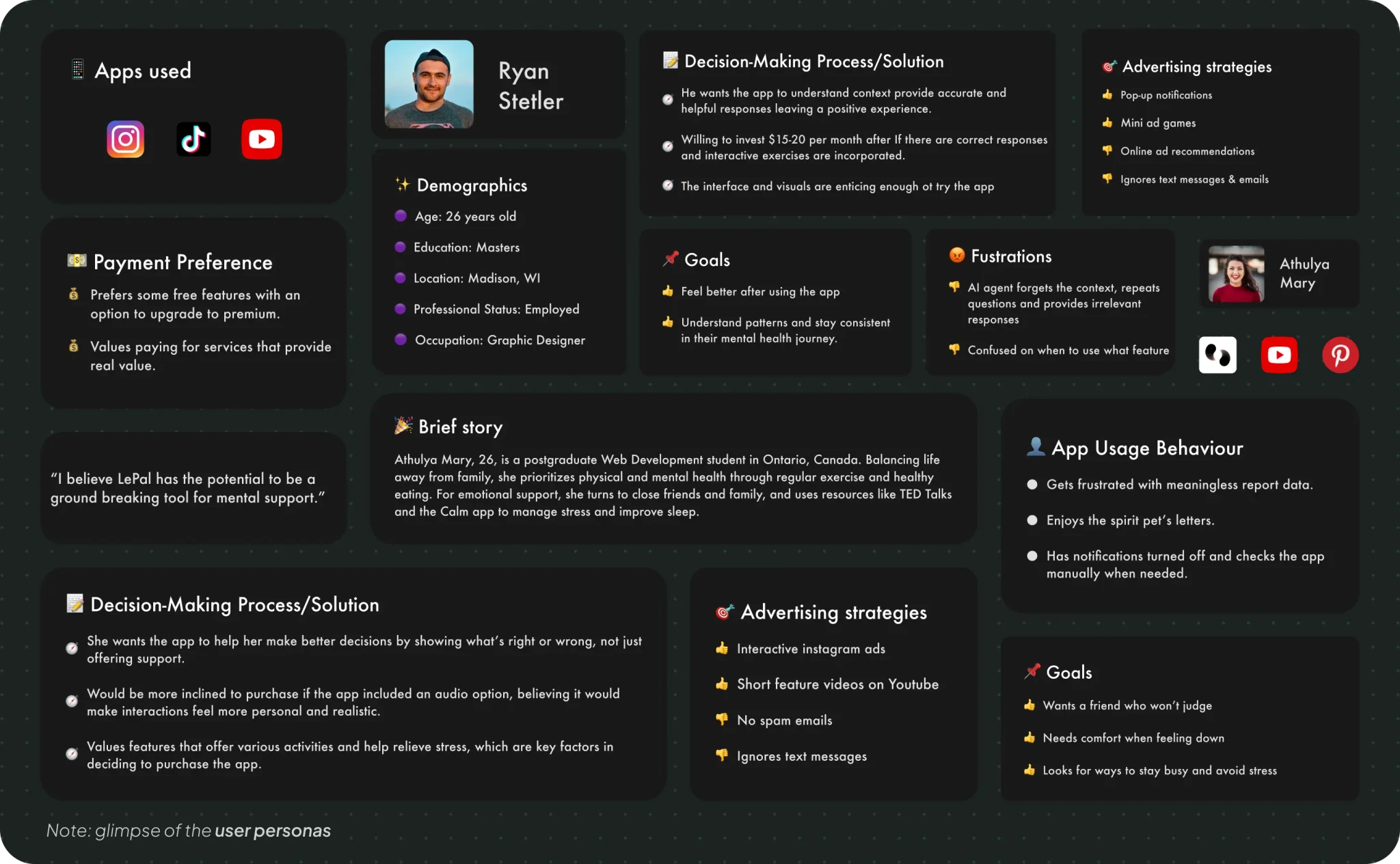
We conducted surveys, interviews, and usability tests to identify key features, user challenges, and barriers that prevent longer engagement with the app.
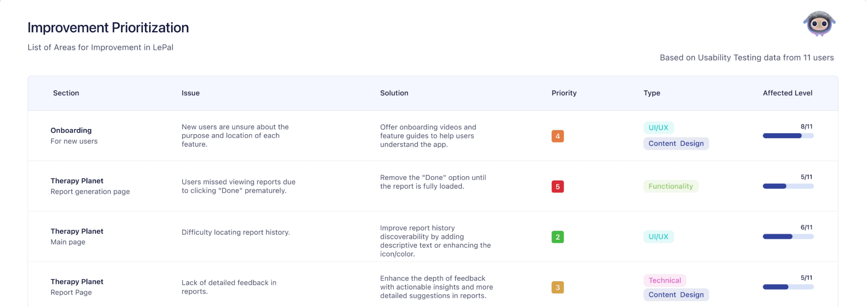
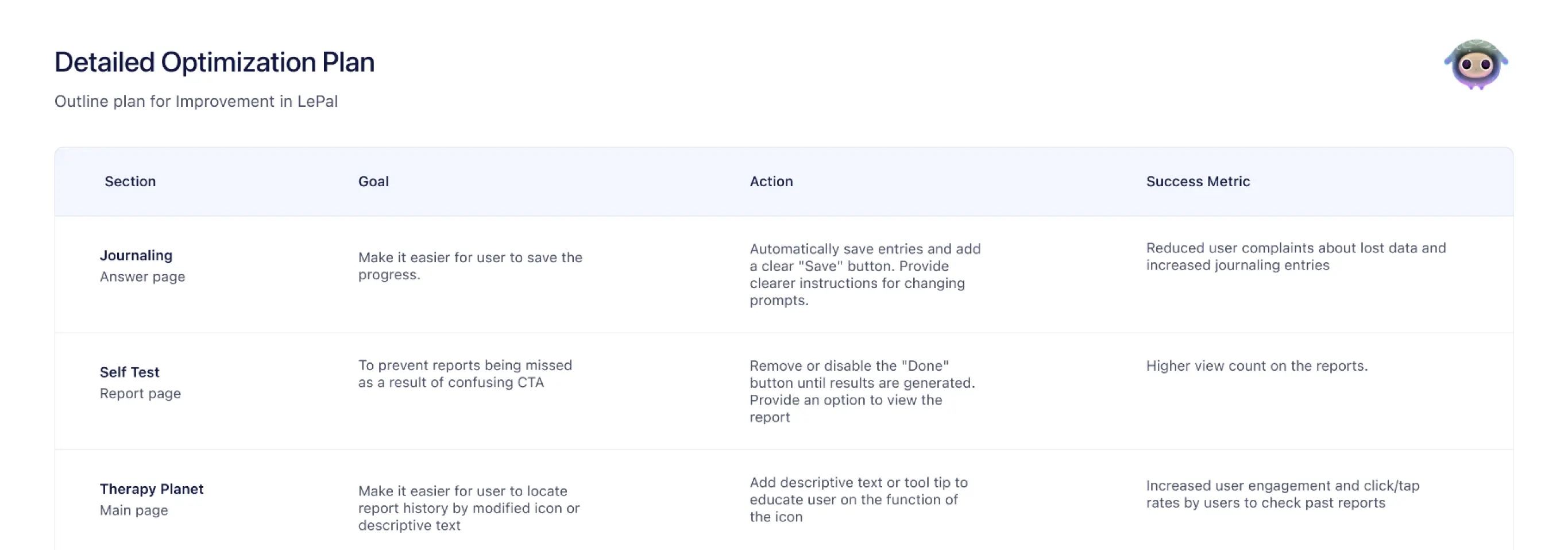
Usability testing provided deeper insights into why users struggled, leading to low retention and engagement. We identified 31 minor and major issues within the app and, based on these results, developed a detailed optimization plan with prioritized improvements.
The journal page's lack of key features, clear navigation, and visibility cues has resulted in incomplete journaling and reduced continued usage, with 73% of users reporting these issues.
01
Poor visual hierarchy and lack of usability features
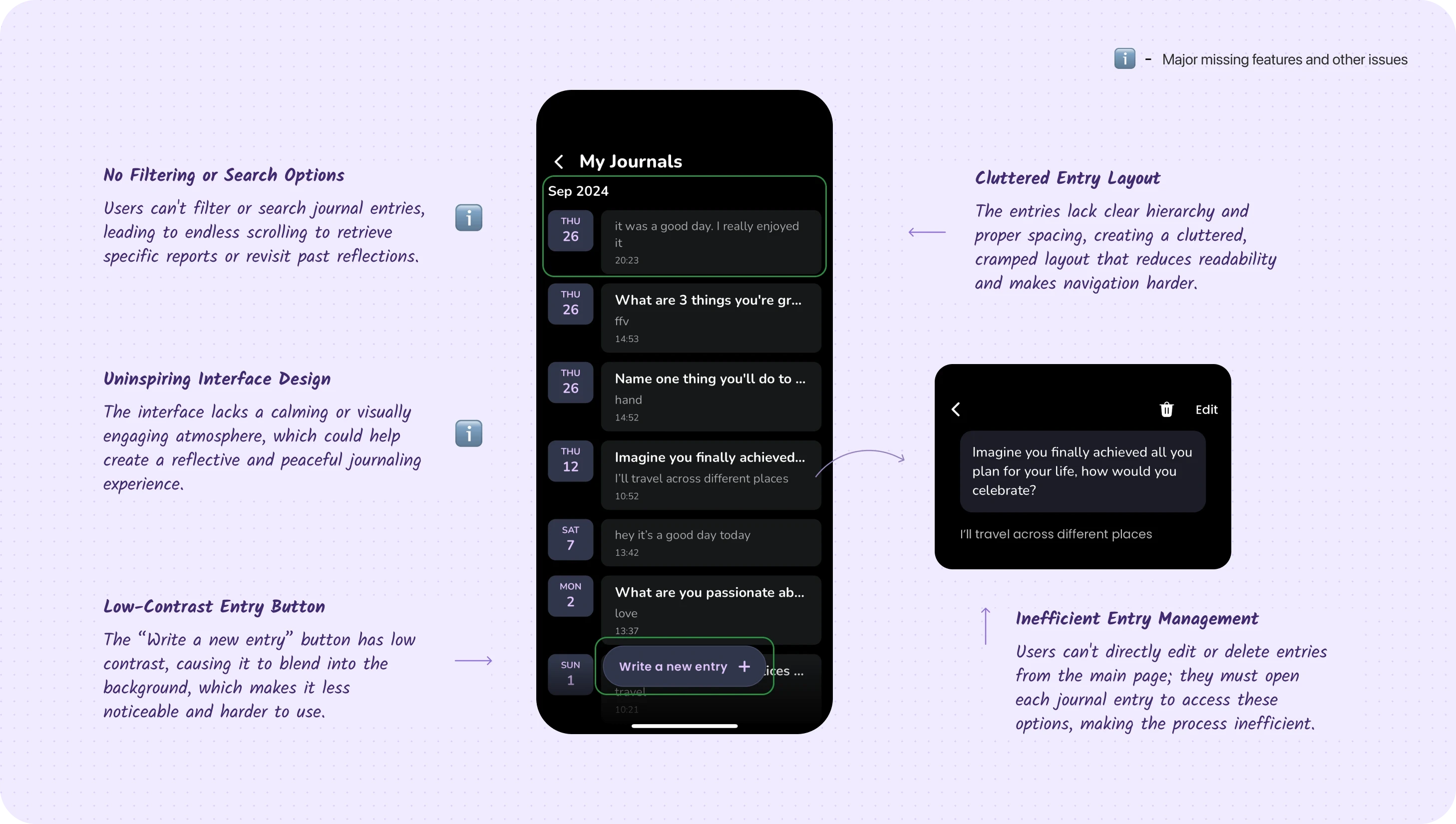
User interviews revealed that the journal page feels too empty and lacks engaging features to encourage repeat use. Beyond displaying basic journal information, it fails to create a welcoming or interactive experience that draws users back.
“ It would be great to have a feature that shows how many entries I've made. ”
“ I wish I could easily access the journal report for a specific day, instead of having to scroll endlessly. ”
" The interface feels old and unattractive, which makes it less enjoyable to use. "
Usability testing showed that 6 out of 11 users struggled with endless scrolling to find specific journal entries and found the deletion process inefficient, as it requires opening each entry individually. These issues negatively impact overall usability and user experience.
02
Absence of Mapping and Lack of User Guidance
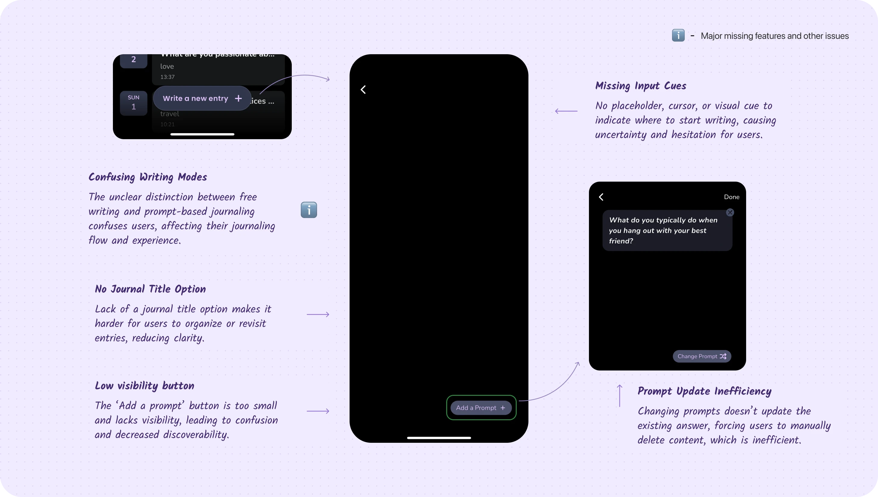
During usability testing, new users struggled to understand how to use the journal entry page, with 84% expressing frustration over the interaction process. Many were unaware that they could write freely without using the prompts.
" I'm unsure about how to proceed because there’s no guidance or information provided. "
" I didn’t realize I could free write without using the prompt questions, which is a bit confusing for me. "
Journal page design with improved navigation, enhanced discoverability, and new features to boost user engagement.
01
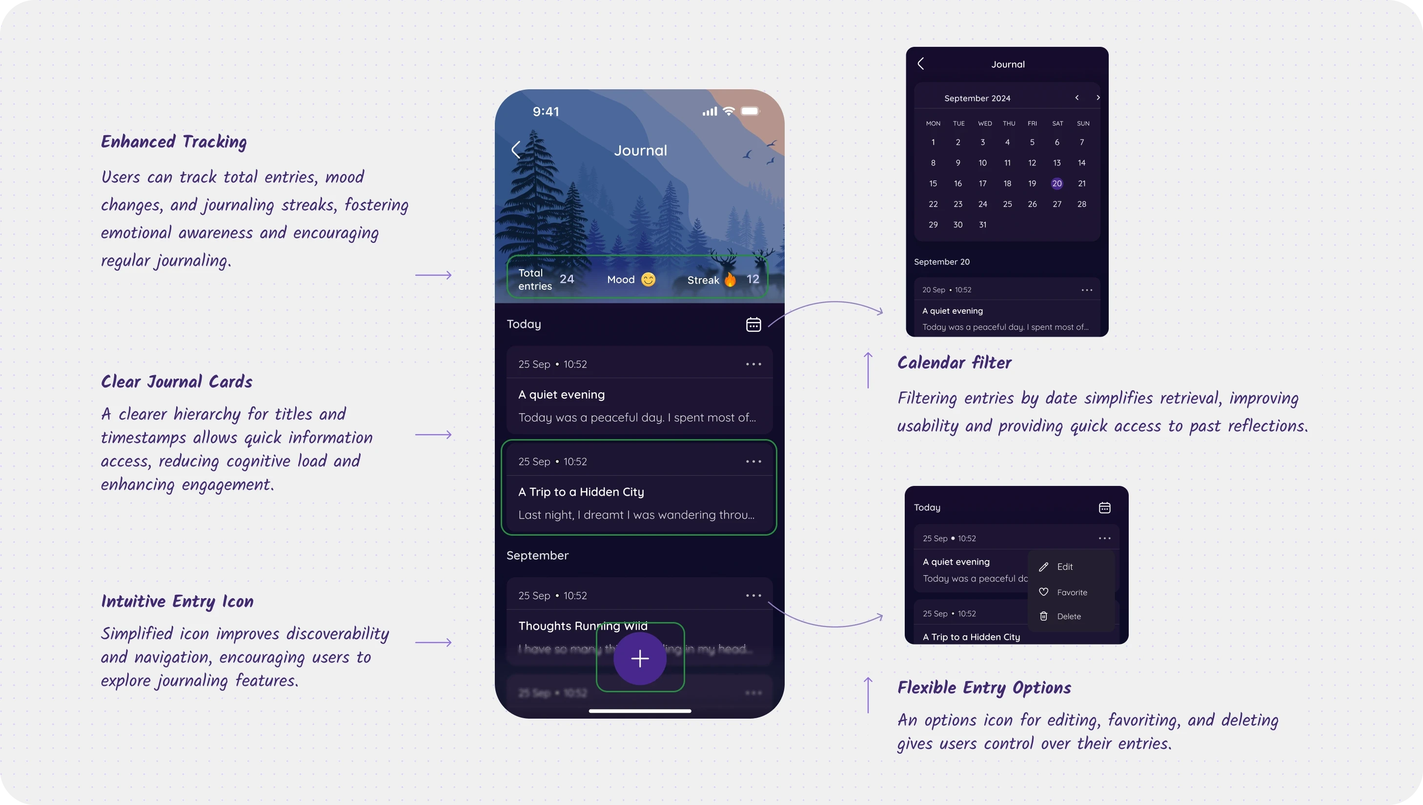
Optimized Journaling: Enhanced Tracking, Easy Navigation, and Simple Entry Management
We added new features like streak tracking and total entries to motivate user engagement with the journaling feature. Based on research, we implemented filtering options and streamlined journal entry management. Additionally, we enhanced the overall structure for improved organization and navigation.
02
Optimized Journaling: Enhanced Tracking, Easy Navigation, and Simple Entry Management
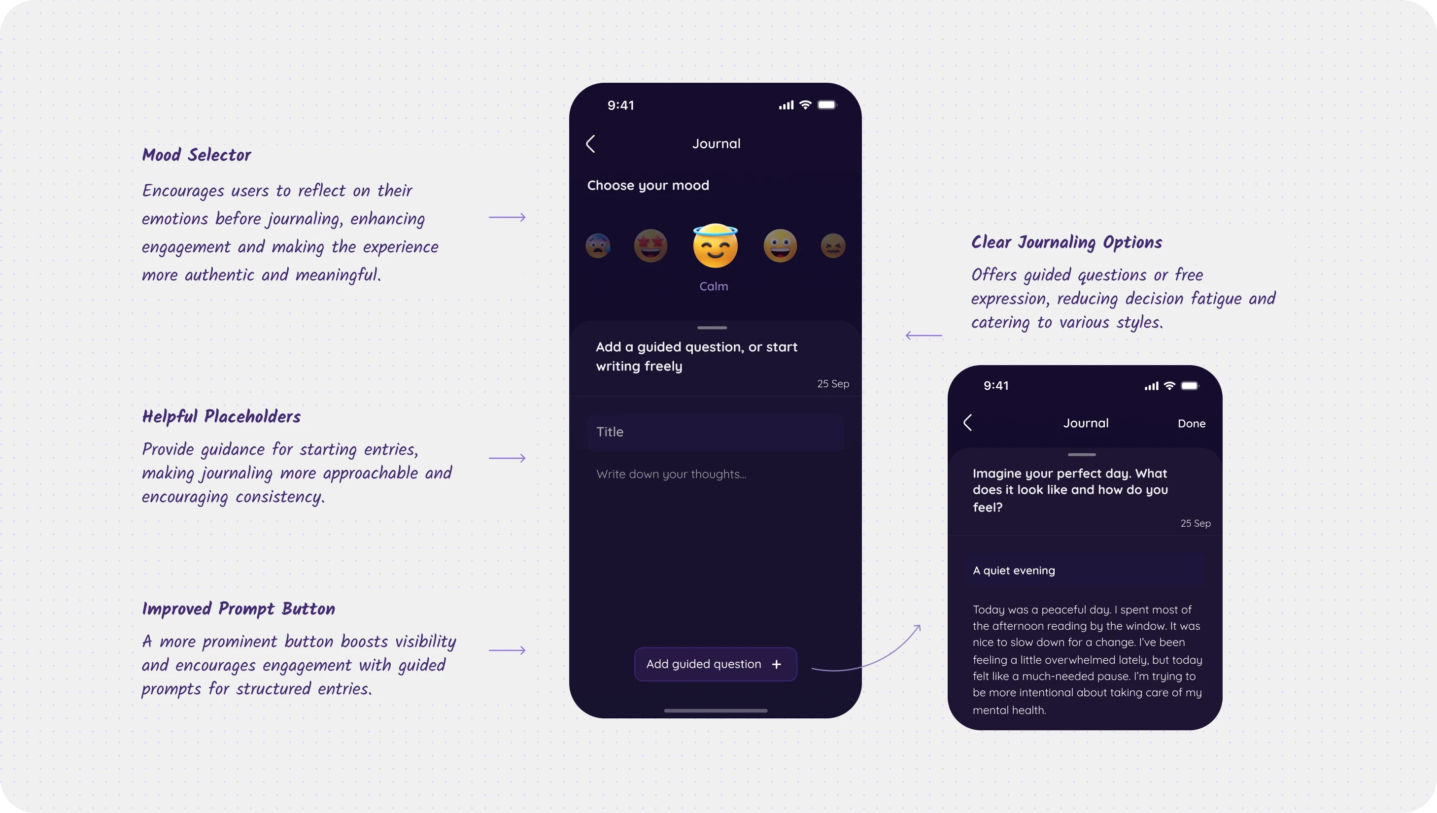
A new mood selector enhances user engagement and gathers insights into users' feelings during journaling. Additionally, placeholders and clear guidance provide direction for users, offering options for both free writing and prompted entries.
Adding a guided question or free writing option directs users to a slider page with ample writing space. This creates a fluid interface with clear navigation, allowing users to easily slide down to adjust the mood selector.
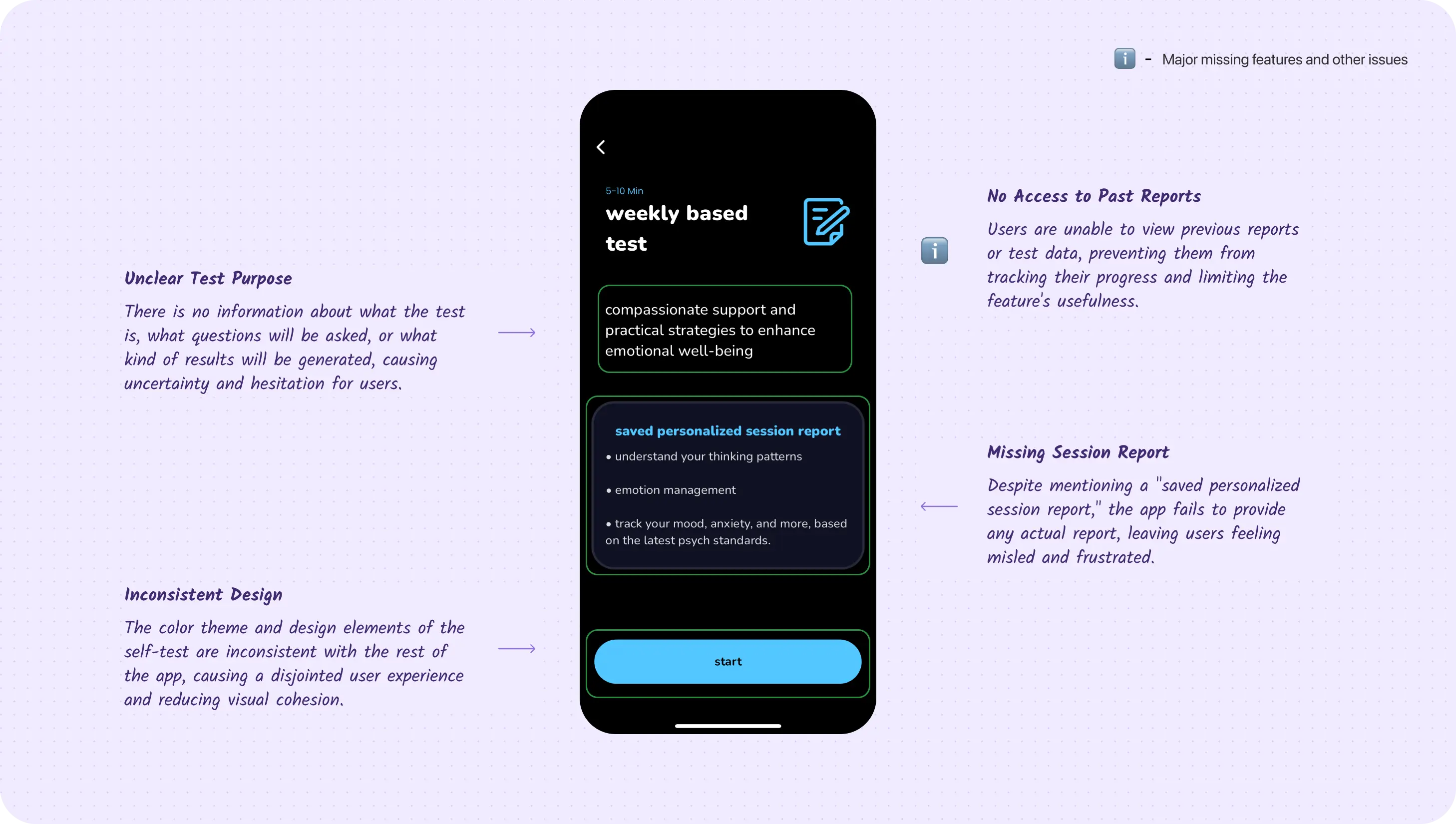
The self-test page lacked guidance and clarity, hindering access to past reports and fluid answering, resulting in a 73% increase in user frustration.
01
Lack of Test Clarity and Report Issues
Following usability testing, users expressed confusion about the purpose of the test and the types of questions being asked. They also wanted clarity on how the test would benefit their mental health.
" Why can’t I access my test results again? It says I have to wait a week to retake the test. "
" It would be helpful to receive recommendations after completing the test. "
A significant 72% of users reported feeling that the lack of guidance and information diminished their trust in taking the test.
02
Lack of Test Clarity and Frustrating Reporting Issues
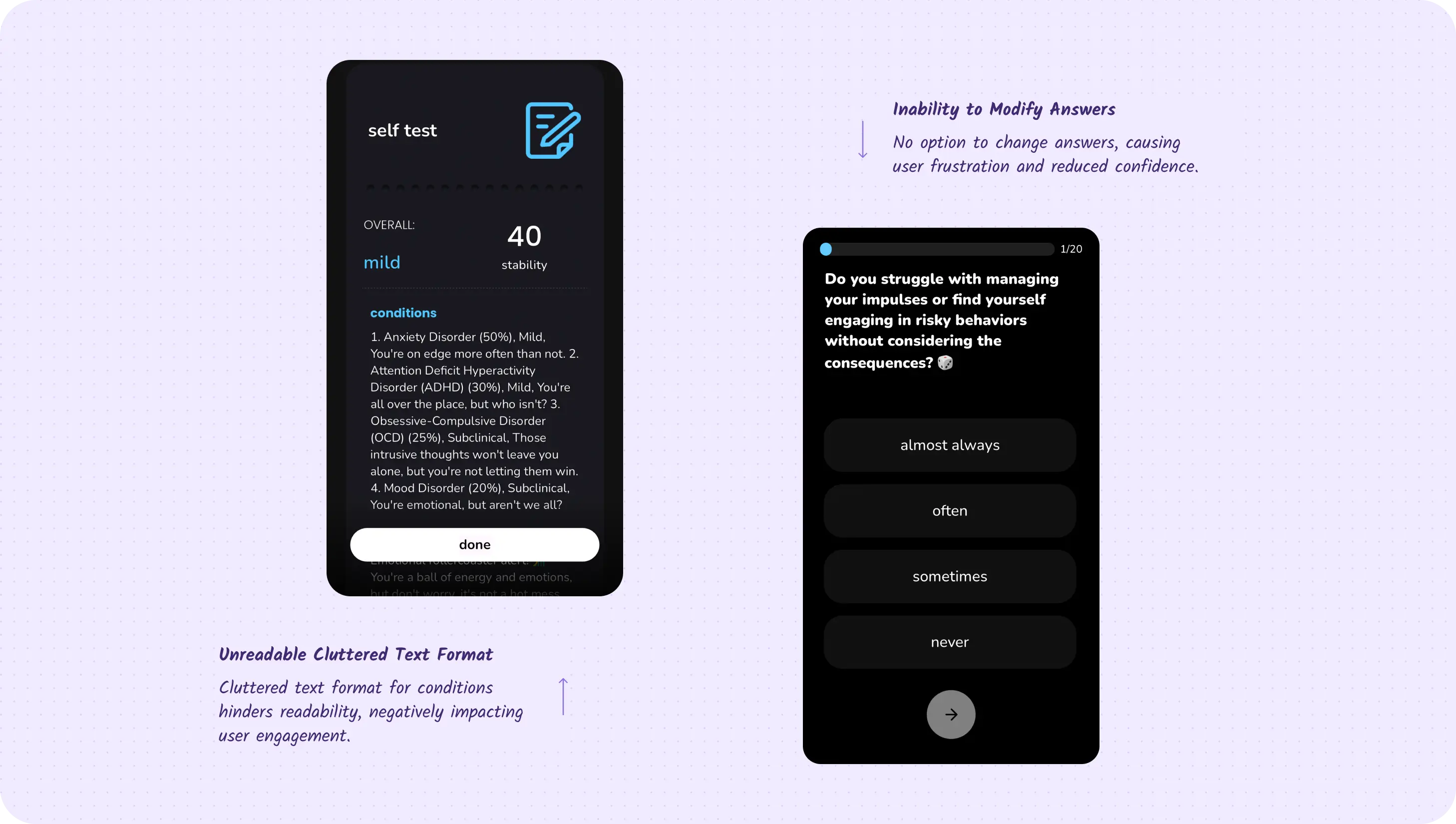
Users expressed frustration at not being able to return to previous questions, especially when they quickly realized they had selected the wrong answer. Additionally, feedback indicated that users found the report difficult to read.
" Why can't I go back and review my answers? "
" It's difficult to read the report. "
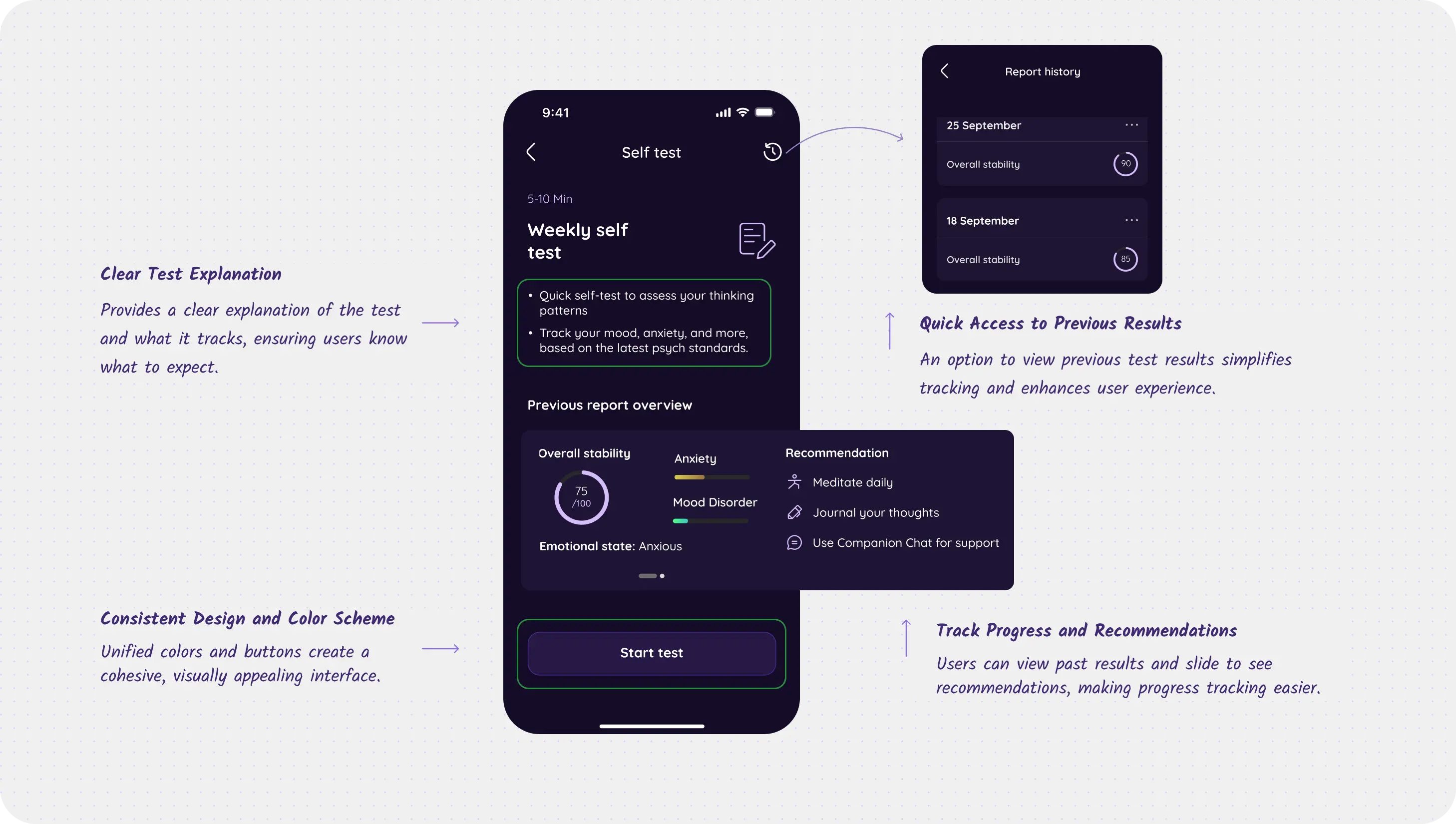
Enhanced the self-test page with improved guidance and mapping features to help users track their mental health, along with better visual representations.
01
Improved User Guidance and Design Consistency
Provided clear information about the test to enhance user trust and understanding, along with an overview of past tests and tailored recommendations for easier progress tracking, while also allowing access to previous results and reports and ensuring design consistency with the app.
02
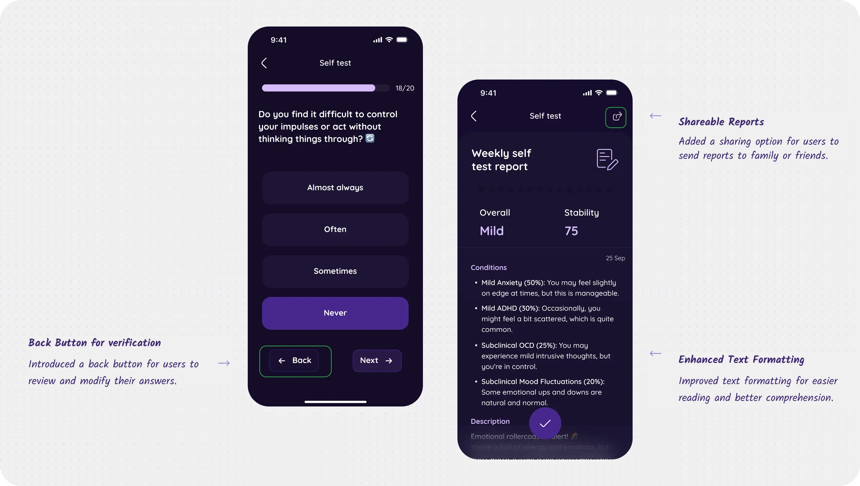
Improved Readability and User Interaction
Text formatting was previously unreadable, so it has been updated to bullet points with bold titles and values for better visibility. A report-sharing option has also been added to enhance the utility of the report for mental health management.
Users expressed frustration at being unable to change their answers, so a back button was added to allow them to review and modify their responses before proceeding, thereby increasing their trust in the process.

